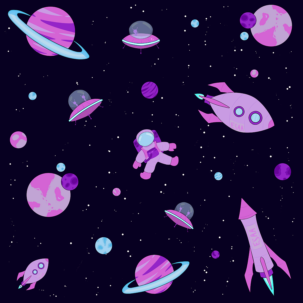
The Pacific “Purple Space”: My New Art Agglomerate
I love space. The concept of everything we know flying through an endless void on a rock the relative size of a dust particle gives me that perfect, existential feeling I can curl up with on the floor at the end of a long day at work. Okay, maybe not, but the noiseless void and the feeling of weightlessness that comes with space is something I think we all wish for occasionally in a world overstuffed with stimuli. I know for me, a yearly trip up to the stratosphere in an astronaut suit would do wonders for the psyche, don’t you think?
That was my inspiration for my most recent collection, simply titled “Purple Space”. What I lack in title creativity, I make up for in art skills. The Purple Space art collection holds a myriad of carefully considered designs. With each new addition I considered what looked good both by itself and within the overall aesthetic of the collection. I used a variety of different guidelines that determined the style, the color scheme, and even the font used. Finally, I pushed for a different perspective of the concept of space then one I was accustomed to.
The Planets Make the Solar System
Purple Space is first made up of seven individual drawings. Next, I combine them, with a background added, to create a larger whole. Finally, I used one to two drawings to create four alternative pieces. The astronaut is the central figure of the main piece, my personal favorite of the collection, and the drawing I worked the longest on. Beyond that are two (or technically three) alien designs, two rockets, Saturn, and a planet with two moons.
I’ve featured a slideshow of each piece as well as my thought process for each piece.

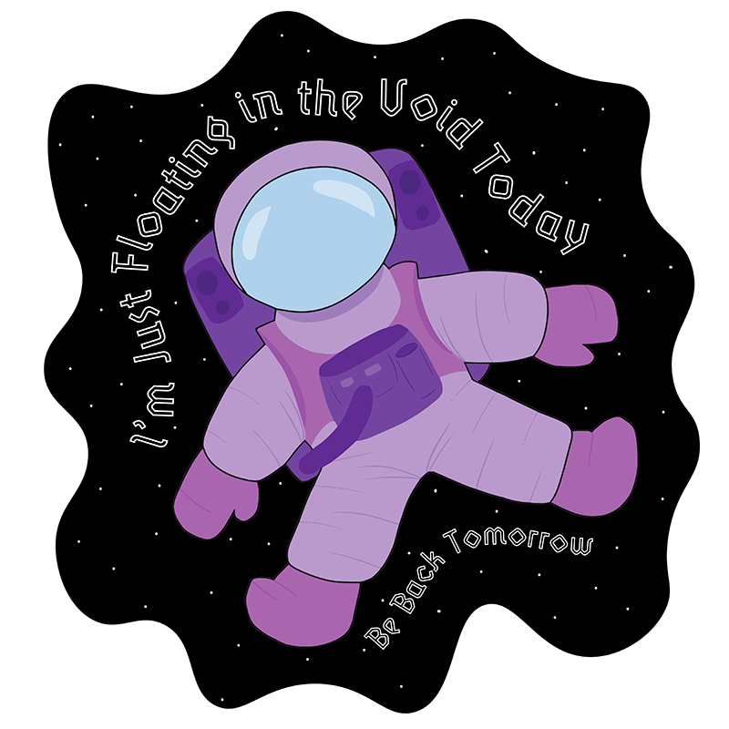
My personal favorite, the astronaut was designed to look like a stuffed toy.
With the astronaut, I first referenced a collection of different images found over the Internet. Then in their design, I used the black outline to indicate an overlap in different parts of the design in combination with a focus on curved lines to make them look pillowy, like a stuffed toy. This makes them look a little cuter even with their current predicament of floating aimlessly through the infinite void of space.

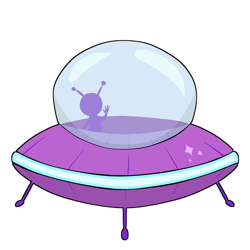
First addition to Purple Space and almost entirely symmetrical.
The first addition to Purple Space that I drew. Using symmetry lines in Clip Studio, I made the whole thing symmetrical to one another right down to the two aliens inside, then added asymmetrical reflections in the dome for visual interest.
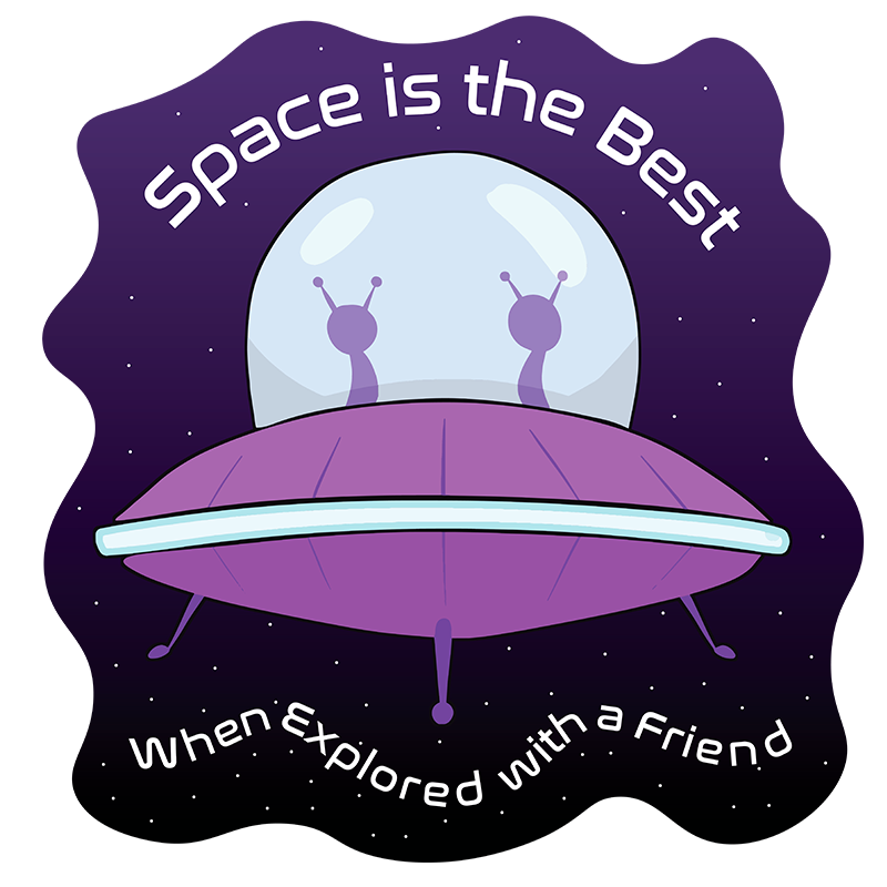
Second UFO design with more character. Say hello!
With this UFO design, I didn’t want to make the whole thing symmetrical again, so I drew a single alien on the left and a star logo on the right. The logo represented whoever designed the UFO, similar to the logo in the grill of a car. Also, I went for a top down look to get a little peek inside the UFO. Still have no idea how they fly that thing.

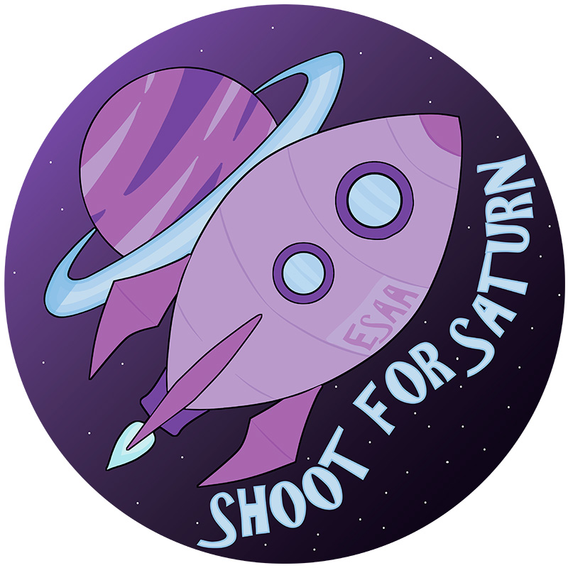
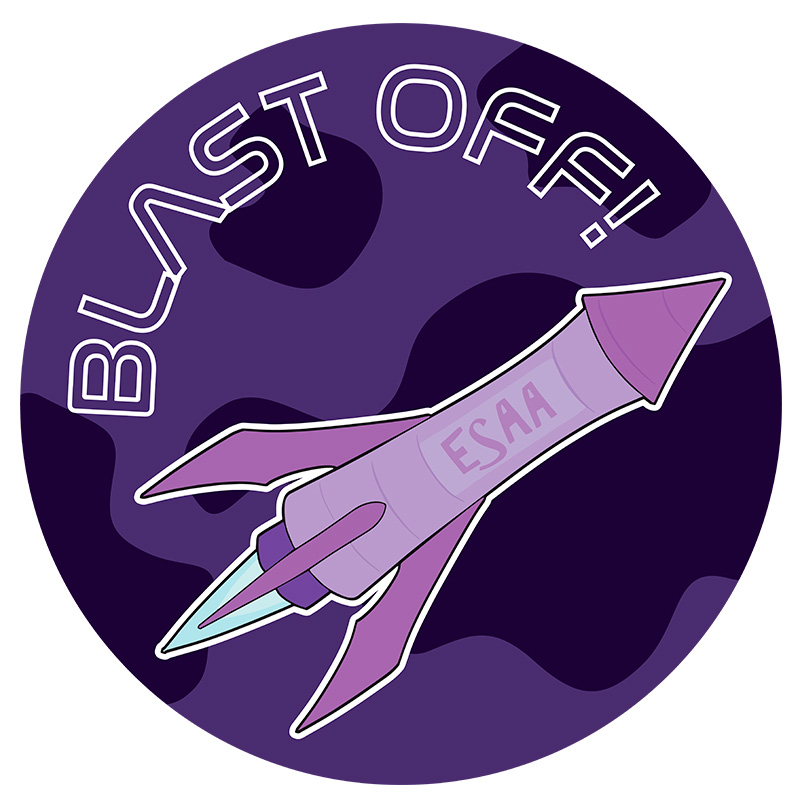
ESAA is an acronym for Earth’s Space Administration and Aeronautics.
The color blue resembled light and glass thus far, so I used the brightest blues in my palette for the fire. Both rockets were drawn symmetrical, with “ESAA” added to create some visual interest. ESAA is an acronym that stands for Earth’s Space Administration and Aeronautics, as a play for what NASA stands for (National Aeronautics and Space Administration).

A rocket with more room for people from the ESAA.
Made similar to the other rocket, but a different shape for some visual variety. I figured that this rocket was more suited for people to actually use to go into space because of the added room and portholes. Perhaps this is the rocket that the Astronaut was flying on before they floated off?

I drew my favorite planet for Purple Space.
I drew two planet designs as filler for the larger Purple Space artwork, and this was my favorite. It also made for a fun alliteration with “Shoot for Saturn”, so I ended up using it for an alternative design that will be featured later.

The inspiration for the small planets seen on the featured Purple Space artwork.
The simplest of the drawings for Purple Space, with some visual interest in the jagged forms of the planet’s continents. For the moon at the top I used blue where previously it was only used for fire or glass because a light and dark moon looked more visually appealing. I added more of these moons later in the larger Purple Space Artwork.
The Laws of the Universe…
With all additions to Purple Space, I followed a set of guidelines for the style, font used, and color scheme. For the style, I used simple silhouettes and minimal detail for a style that looked cartoony, but not overly cutesy.
Beyond that, to keep the art from blending into the background, I outlined each piece in a thin, black line. I also added a line around different design elements to draw attention to them and indicate overlap. This included the UFO domes and the ring of Saturn.

Wit the font, I sometimes chose the look of a single design over the cohesiveness of the overall collection. My original font choice, AR Christy, I liked because it looked unconventional for a science-fiction collection.
But when I started using it for the alternative designs, I noticed some issues. When I typed on a curved line, for example, the letters would touch one another like in “Shoot for Saturn”. I knew I could space out the letters, but that made the text a little too big for my liking. How some letters in AR Christy “dipped” past the bottom line, like the ‘s’, was also undesirable because it was harder to fit everything in a smaller design.
Are Just a Suggestion
Ultimately, I diverted from the AR Christy save for “Shoot for Saturn” and “ESAA”, and opted for some variety. My goal in the font choice for the alternative designs was to emphasize the feeling each design would have on the viewer, and I chose accordingly.
Here, the font Lunatix OT was double lined, making letters themselves look like they were floating in the background. As well as that, the ‘o’ looked like a star or an asteroid. Those connections I drew made it a perfect choice for this design.
Had I used the AR Christy in this design it would’ve looked too distracting. The futuristic design of this font, named Nasalization also fit with the alien duo as a science fiction theme.
The font here is also Nasalization but I added an outline to make the planet more visible. Like with AR Christy, the letters also touched when written on a curve. However I decided to go with Nasalization because AR Christy looked too casual with the text.
Finally, the color scheme was another huge factor in the design and what brought everything together. Every part of Purple Space is made to be shades of, well, purple! As well as some blues and pink-ish colors. I started the whole project with this color scheme: a diversion of the neon, stark whites, and rusty browns I usually see with mainstream science fiction.
With Purple Space, I wanted art that could give the viewer that feeling of weightlessness and tranquility that comes with floating in the void. I’m not talking about the frigid temperatures or the airless vacuity crushing your lungs, but rather the recess from the stressors of the world. It would just be the planets, the aliens, and you, observing it all from the center.
After We Left Purple Space: What’s Next?
It’s hard to decide when to stop a project sometimes. Normally I start with one or more smaller drawings, then make a larger design where they all are featured, then end it there. Examples of these are on my Redbubble or the Art Page of this website. But with Purple Space, I felt different about it and thus, I wanted to add more. I’m not sure if I am done yet with Purple Space, even if I don’t know what else to add to it right now.
Space itself is so incomprehensibly large, when depicting it I feel free incorporate whatever I want. By virtue of how little we’ve explored the stars from Earth, anything is possible as to what’s out there, thus anything is possible as to what we can image. And while I imagined something only a little bit out of the box in terms of my own color choices compared to what is mostly seen mainstream, I still want to expand further on the idea of the vast creativity of space.
Either that, or dive further into Purple Space and try to make something more with what I already created. One idea was a comic that fit with the feelings implicit in the color scheme and incorporating concepts I’ve drawn, even if I don’t use the art itself. Something with low stakes and a lack of laser battles, alien pirates, or invaders from beyond the stars. Because sometimes I don’t want to create based on danger, but rather what lies beyond that in an incomprehensible realm of possibilities.