My Rediscovered Love for Blender, and What I Made
Preamble
Simply put, I adore Blender. Its the 3D, open source software with a dedicated community using it to create amazing things. Whether or not its the industry standard is irrelevant to me, through the years it remains my favorite 3d software. I’ve been working with Blender since version 2.4, when it still had a game engine. As a kid, I was dazzled by the short films uploaded to YouTube and I wanted to make my own. I still do a decade and change later, I just unfortunately haven’t gotten around to it yet.
Onto my most recent project, and why I’m diverting slightly from the “comic” focus that’s this website’s namesake. To put it bluntly, I have a lot of interests and I’m not good at just sticking to one thing. An at the end of the day, I want my website to reflect my interests. Those interests include 3d art, animation, and Blender.
With the new release of Blender 4.0, and the interesting things I saw being done with it. I knew I wanted to fire it up on my computer and try my hand at 3d art again. Below are two of the projects I made, the first to rekindle my knowledge of Blender and the second to exercise it. I hope you enjoy this very intricate explanation of both projects. But now, like any good exercise, lets begin with the warm up.
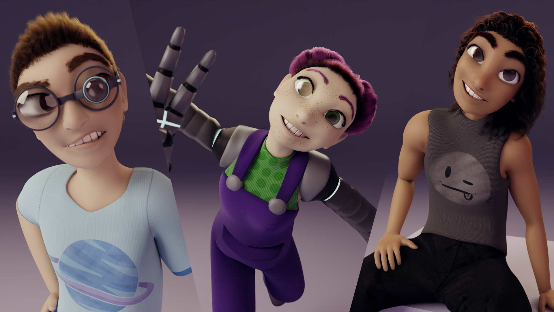
Blockhead Character Process
Modelling and Color
I started with a character from another project I had recently completed.
After not using Blender for 2 years, I wanted to make something quick to refresh my knowledge of the software. In the past, when I made a new character I would draw them first in 2d, then use that image in Blender as a reference. But Blockhead was going to be so simple, I skipped that step and went straight to modelling. I made the head out of a cube, and the body and limbs out of cylinders.
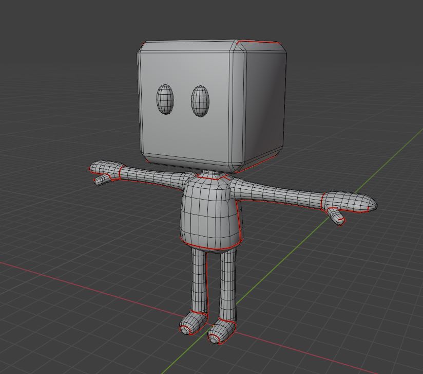
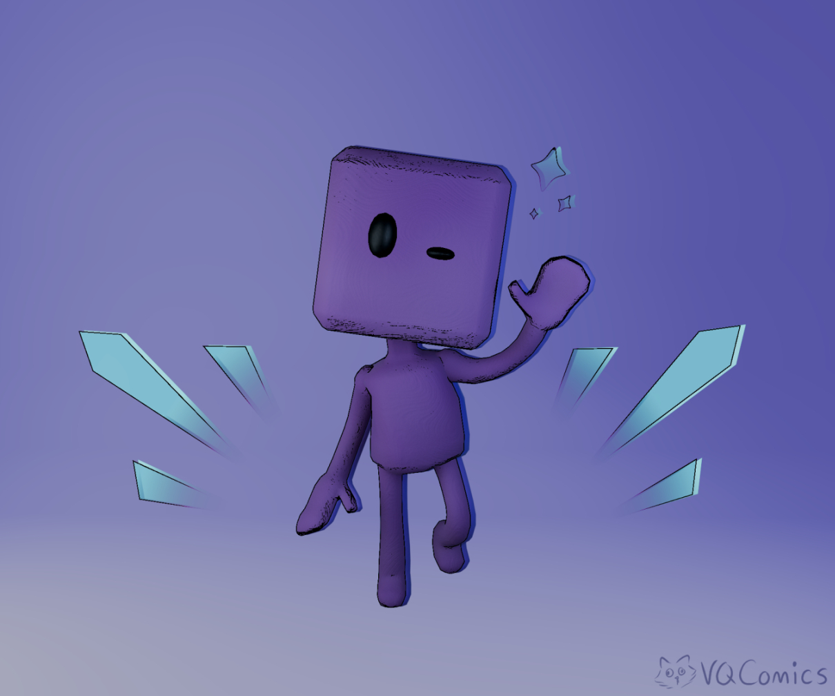
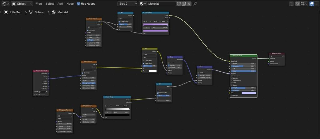
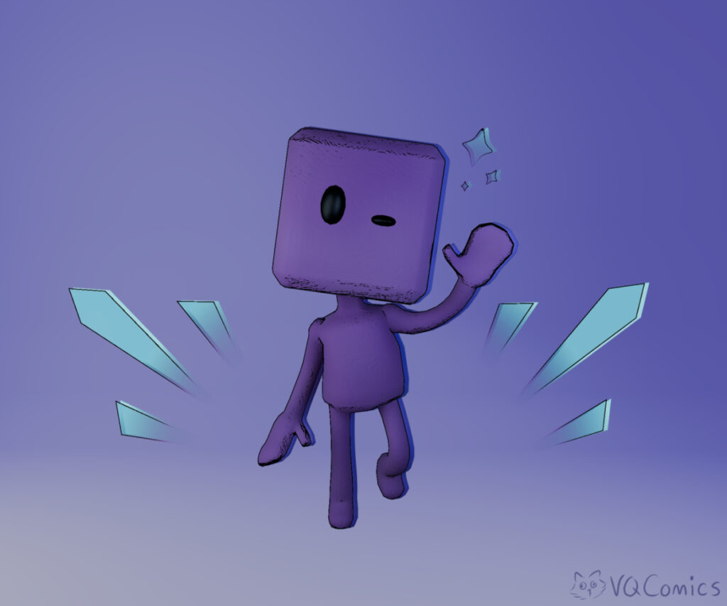
With the geometry as basic as it was, I skipped the retopology stage and went straight to working on the materials shader. Since I wasn’t holding myself to a deadline, I wanted to experiment to see what looked right. I first tried a “clay doll” look, then wooden one when that didn’t work. Finally, I settled on this almost felt-like material with a velvety sheen to it.
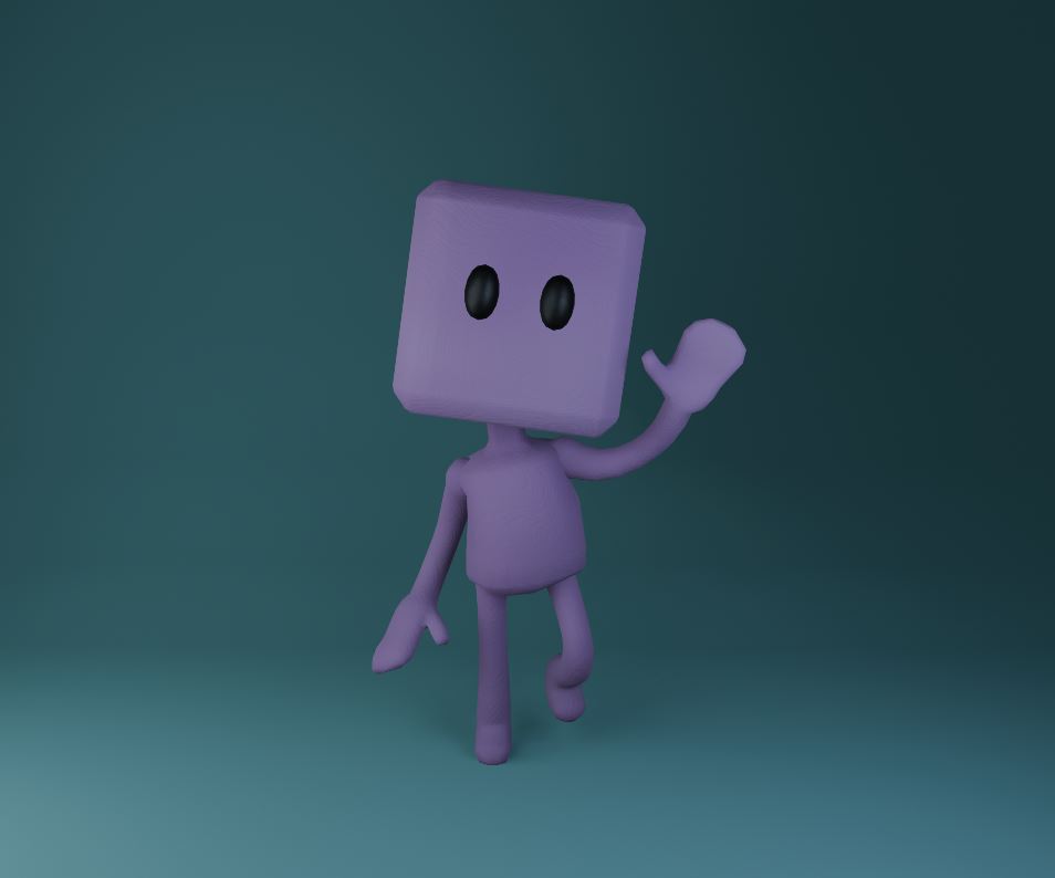
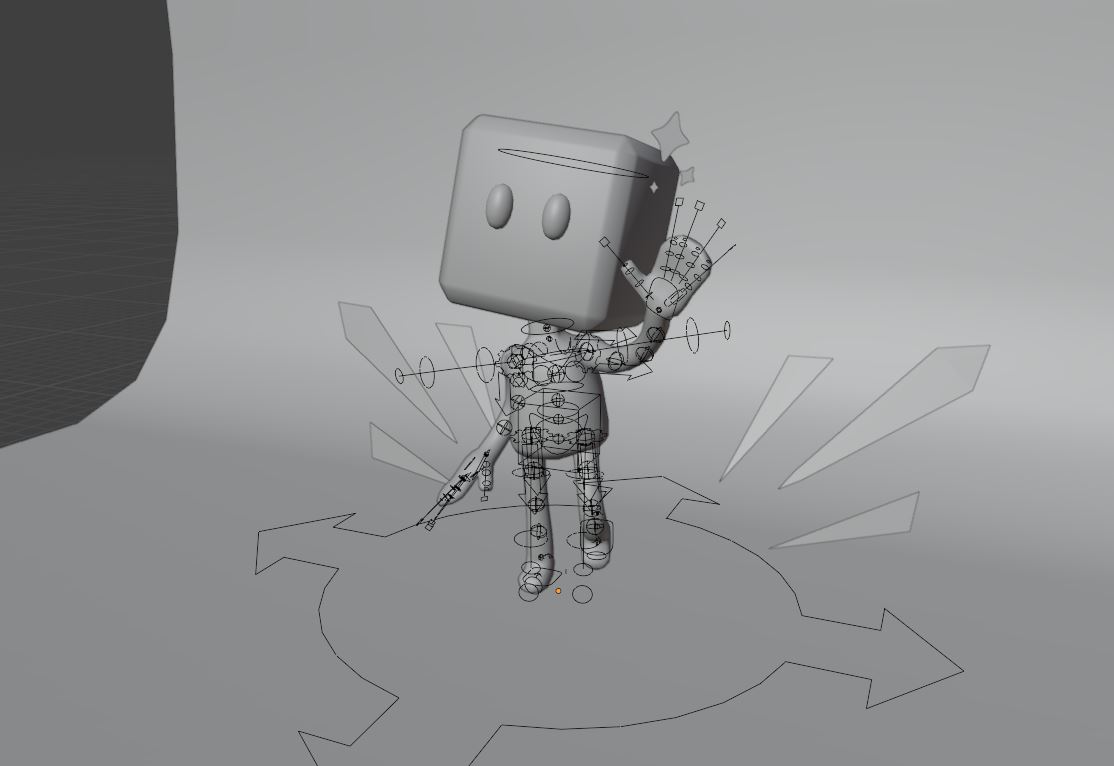
Rigging the character was simple enough with Blender’s Rigify add-on, and the automatic weights thankfully didn’t require any major adjustment. I threw him into a pose, added a simple backdrop with a curved plane, and rendered the whole thing out. When I was satisfied with how he looked, I moved on to post-render edits.
Perfecting the 3d Art
I had a lot of fun with the post-render effects. Post render nodes were something I barely touched in the past, mostly because I found them intimidating to work with. This time around, I wanted to attempt an almost comic book style for the final 3d art piece. I used a filter and color-ramp to fake line-art around the character. Then I translated and restricted the colors of a duplicate of him that sat “behind” the original to create a cool color-bleed effect.
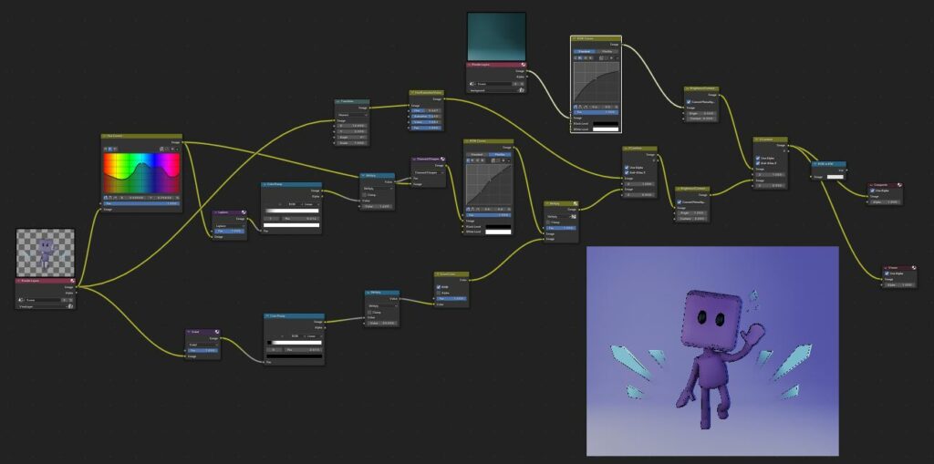
For extra spice, I went back to the project to add the diamond flecks and stars using basic planes. For the material I made a shader with an emission color for added pop. It also featured an alpha that increased the object’s transparency depending on how close the geometry got to a specific point. Said point was defined by an empty near the bottom of the scene.
Since the background was a different layer, I played around with post-render nodes applied to that layer. I got something I was happy with, but accidentally made it look like he was floating in a color void. I tried to avoid this initially with the backdrop, but I liked it here and decided to keep it.
Planthead Character Process
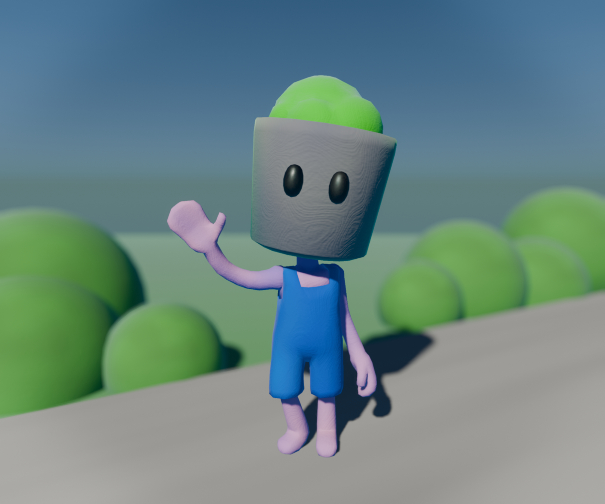
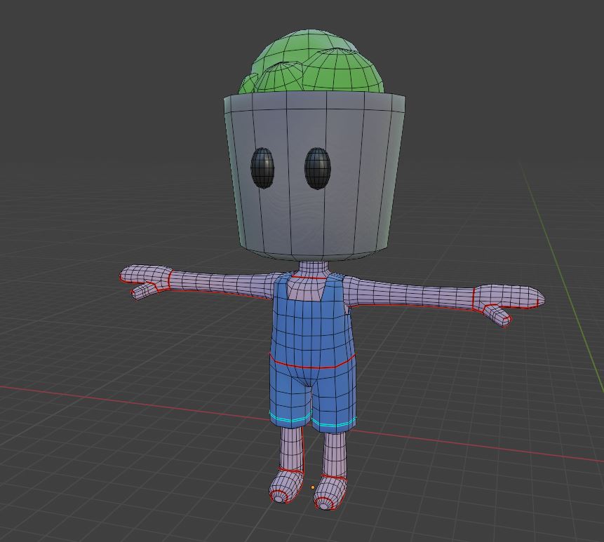
And with that, I moved onto the creation of my other character. For him, I decided to create a gardener with a plant pot for a head and a pair of overalls, naming him Planthead. As Blockhead was already made, the process for Planthead’s modelling was even simpler. I copied Blockhead’s model, tweaked the proportions, replaced the cube with a plant pot, then added the overalls. All of his material shaders were copies Blockhead’s, but in different colors.
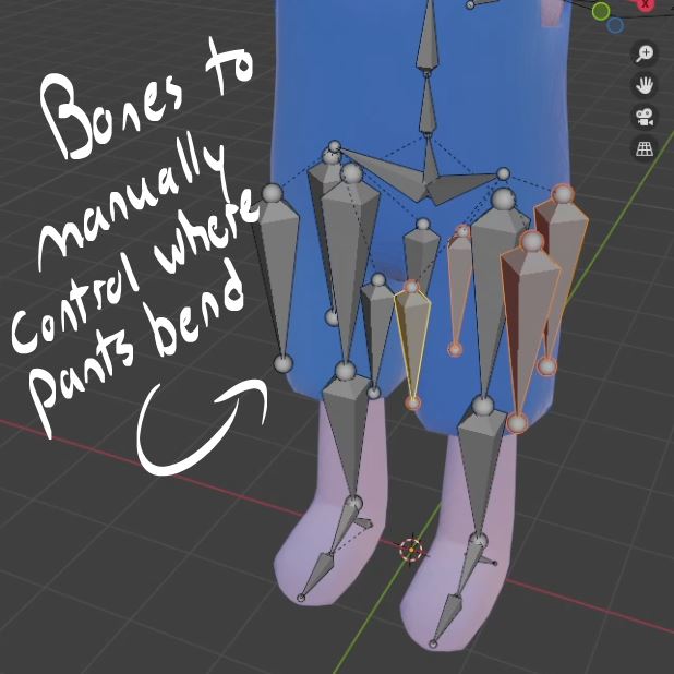
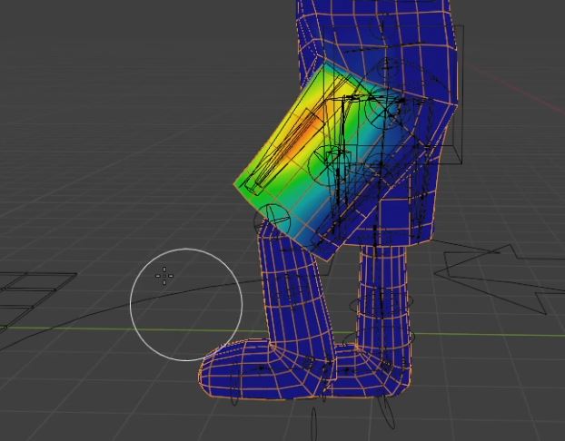
Then it was on to rigging, and weight painting, where I struggled. I tried to use the same rig as Blockhead at first, but I had trouble mapping the vertices of the overalls to the leg bones. When generating the automatic weight painting, it only had the legs affected by the bones, but not the pants on top. Even after correcting it, the pants still curved in a weird way with some awkward geometry. I knew I needed to find a better way of doing this.
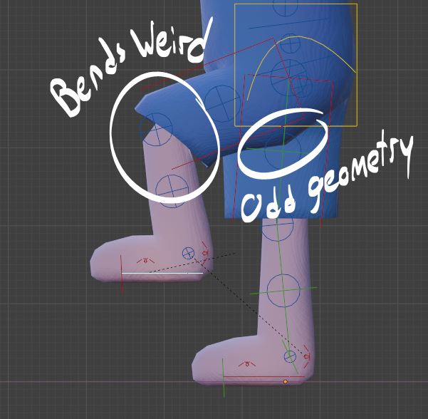
I opted against using cloth simulation because I really only wanted the pants to move to specific poses. Trying to implement complex simulation for still images of simple characters would be too unnecessarily strenuous on my computer. Instead, I went for extra rigging, first adding bones to circle the hem of each pant leg. After weight-painting however, I noticed that I needed to to translate the bones in this rig in order to position the pants. This not only gave an awkward “parachute” effect but it caused a lot of geometry clipping and headaches so I scrapped it.
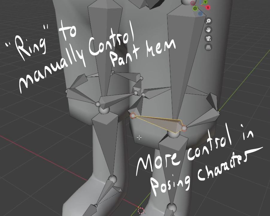
In my second try, I created a circle of bones around the pants like upright sticks. This allowed me to position the pants in sections, using rotation instead of translation. Results were a little better, but not perfect. In positioning the character to actually sit on the bench I ran into problems with it clipping through the wood. When I did try to translate the bones, they kept warping the geometry more than I thought was realistic. Eventually, I moved on, noting to myself to position the camera at a high angle to keep any awkward clipping invisible to the viewer.
While Planthead is definitely not perfect, I still enjoyed creating him. Firstly, his design is very cute, and that made me happy. Even with all the trouble weight-painting the rig gave me, I still appreciate the practice and I learned a lot. Below, I rendered a quick 3d art piece of him because I realized Planthead didn’t have his own solo image.

Modelling the Scene
Creating the Bus Stop
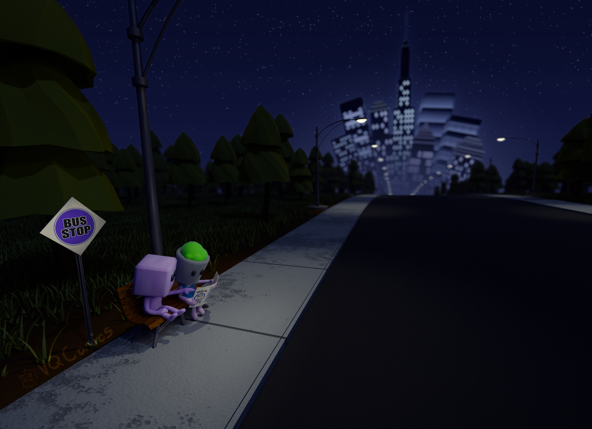
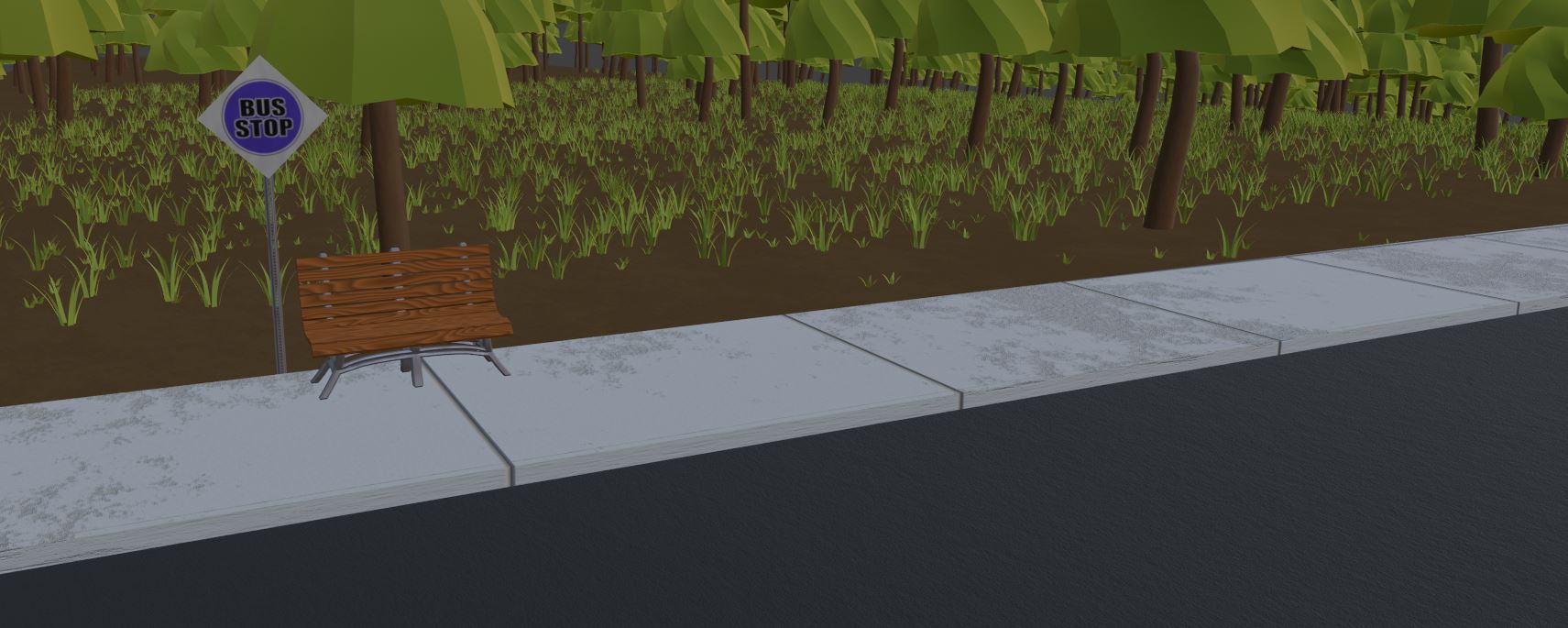
Now that both characters were done, I shifted focus to everything else that needed to be modeled. At this point, I had the idea of the two characters sitting at a bench near a bus stop and a forest. I started with the bench and ended up creating two versions.
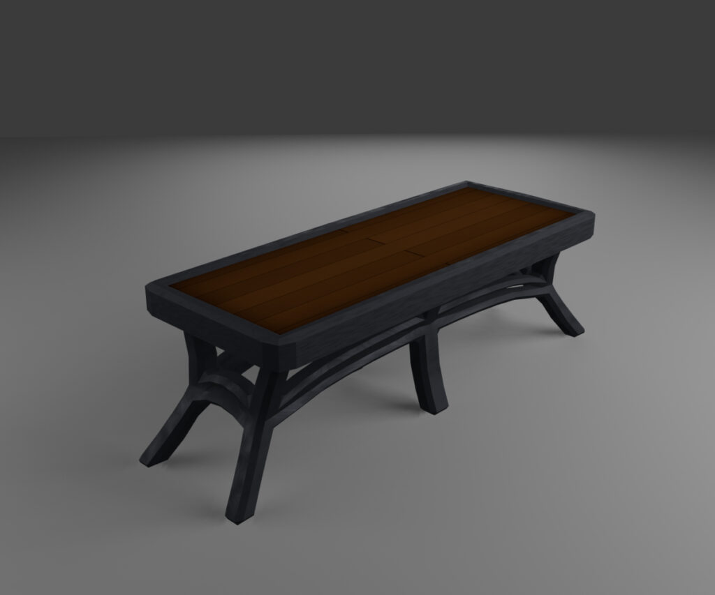
My first attempt was a backless slab on a metal frame that featured a weird border around the wooden seat. I scrapped this mainly because I knew it would be uncomfortable to sit on in the summertime, thus wouldn’t be realistic.
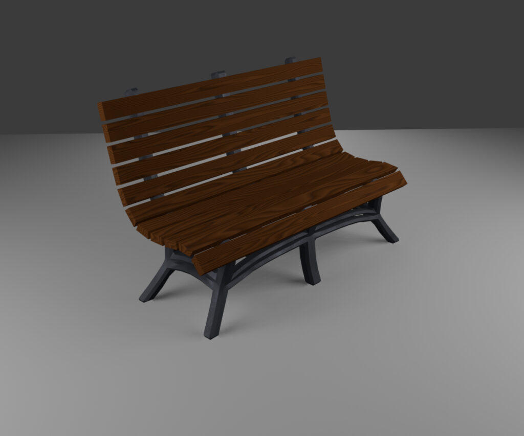
The second attempt was where I actually looked at a reference of a park bench. For the seat, I used an array of rectangles that I modified to follow a curve in the center of the bench’s frame. I liked this a lot better, and ended up using it for the final 3d art.
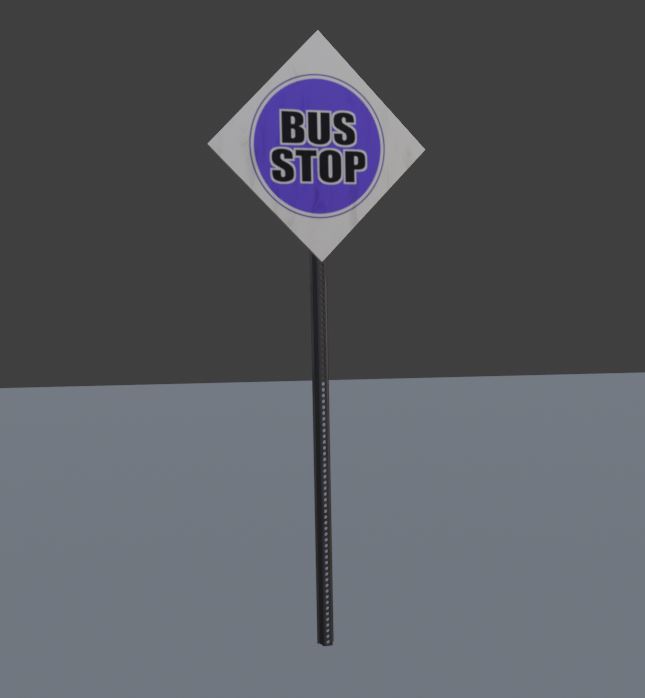
For the sign post, I followed my references closely. I started by making a U shape, then added two holes with the boolean modifier and cylinders. Next I duplicated that with the array modifier until it felt high enough. Finally, I flattened the simple cube and turned it to a diamond shape for the sign. I used the metal material I made for the bench on the sign post. For the sign, I made a quick texture in Clip Studio and added some noise to the roughness of the Principled BSDF shader to give it some imperfections.
Making the Forest and the World
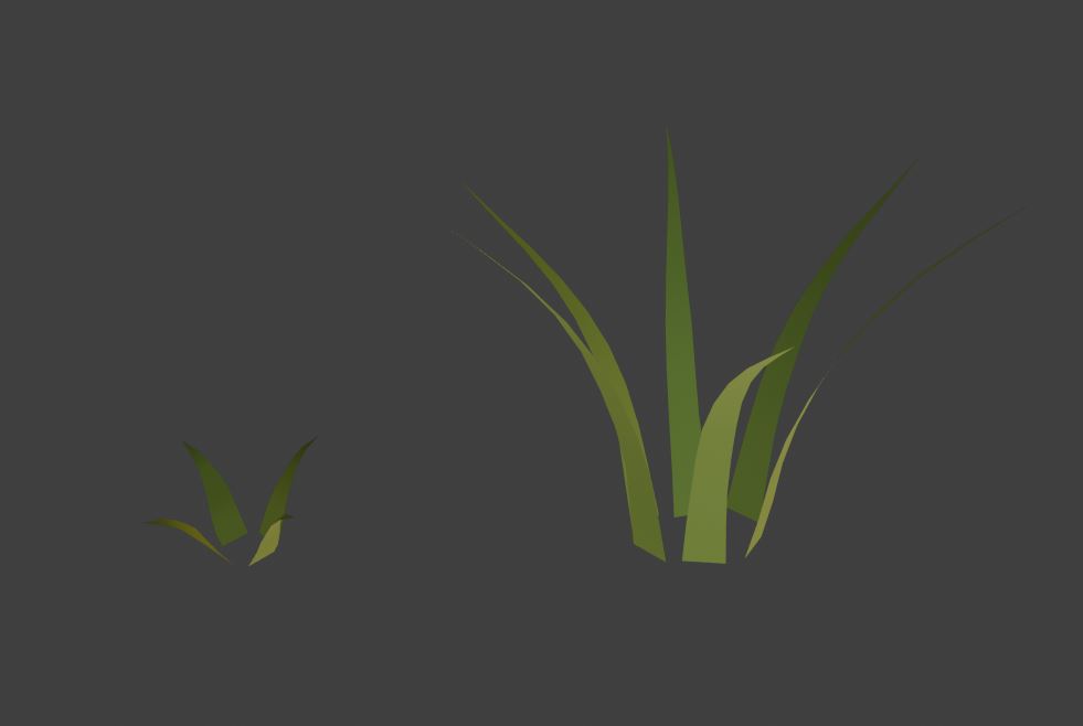
After the sign was done I moved on to the forest nearby. Plants are not my strong suit, but with this project I was determined to try. I added two particle effects to the ground object, one for grass, the other for trees.
For the grass, I first made a flat grass blade and copied that four and six times, respectively. Then, I molded each blade individually to curve outward from one another, using the 3d cursor positioned near the base as an axis of rotation.
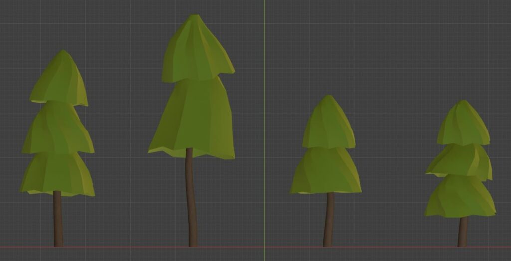
The trees were made out of one cylinder for the trunk and two to three cylinders for the “leaves”. For each part of the tree, I would then increase the geometry to curve and mold in unique ways. In total, I made four of them of varying sizes.
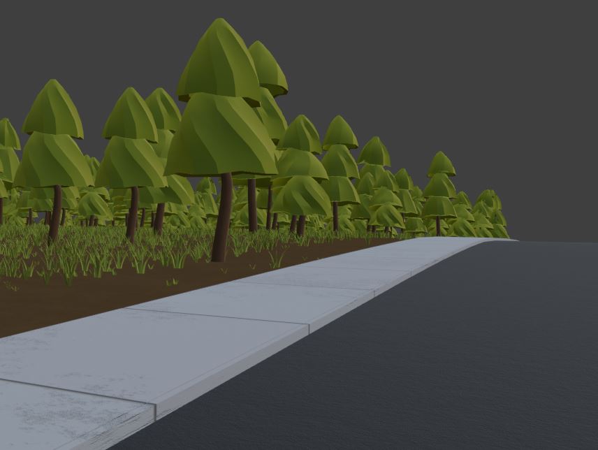
Then it was onto the sidewalk and the road. If I had to make the project again, I would have made the texture for the sidewalk by hand, rather than using Blender’s brick texture. Several times I had to re-calibrate the texture variables so the sidewalk grout would only have horizontal lines. Then again to make sure the sidewalk “bricks” weren’t too big. To make it more complex I added some imperfections to the sidewalk using a noise filter put through a color ramp. This, mixed with the other noise filter meant to roughen the sidewalk concrete, also required a lot of adjustments.
By the time I got to the road I wanted something simple: a black base color and a noisy bump map. Looking back I accidentally missed the road paint in the center, so I’ll need to remember that for next time.
Planning My 3d Art
Context and World Adjustments
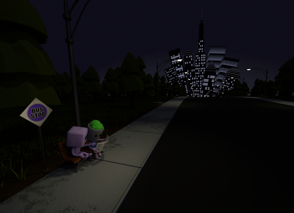
I found myself stuck on where else I wanted the 3d art work to go. I had the characters, the forest, the bus stop, and the road, but right now said road led to nothing. While doodling some ideas at work the next day, I decided that Blockhead and Planthead were visiting a large city. They would be waiting at the bus stop at night with the city skyline in the background, looking at a map.
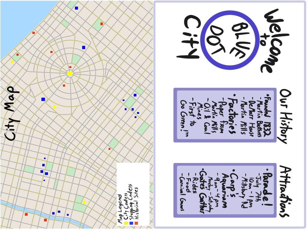
I added some basic story beats to the city while making the texture for the map Planthead was holding. Blue Dot City, as I called it, was originally a mining town, but later on became known for its production of paper. It has an aquarium, a yearly parade, and a theme park. On one side I used a free generator on itch.io, then added some points to mimic popular tourist attractions. On the other side I made the city’s logo and a bulleted list of basic history and attractions. Most of the map wouldn’t be visible in the final render, but I still wanted it to look somewhat believable from a distance.
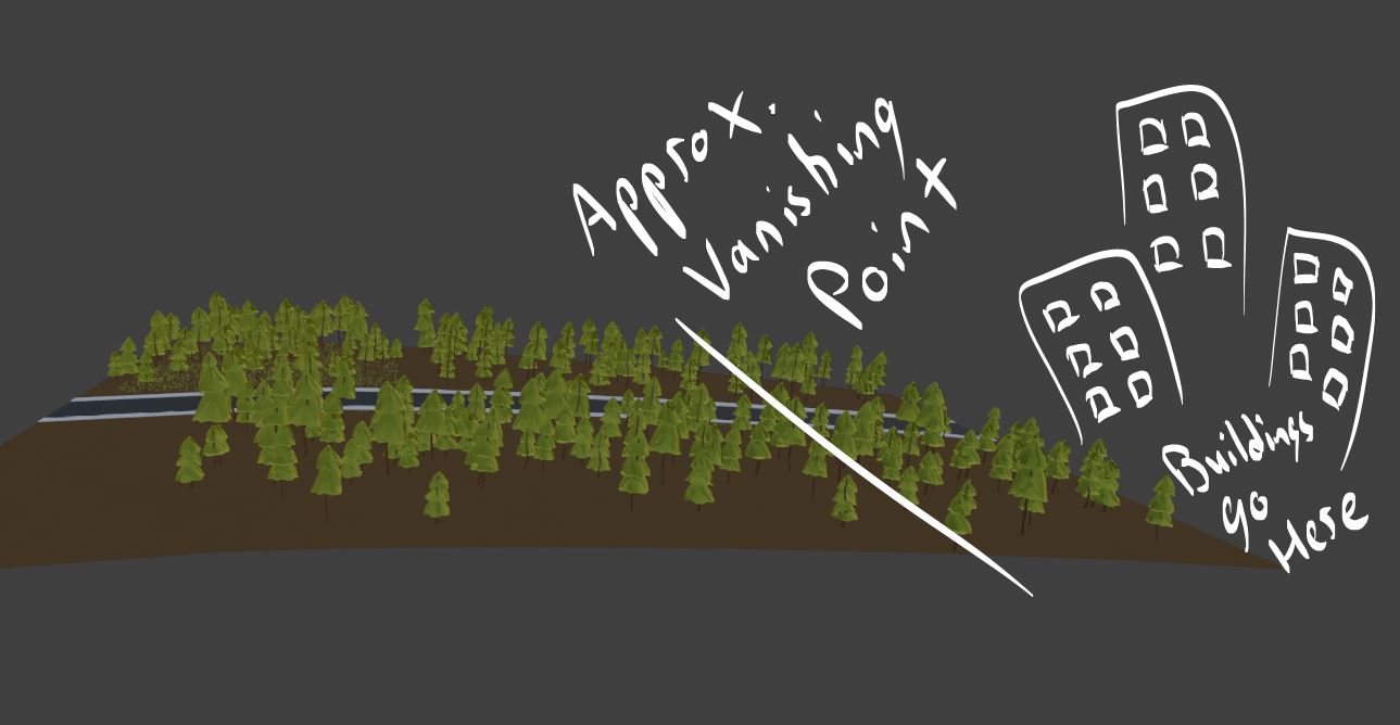
Coming back to the scene as a whole, I had to make some major changes to hide the fact that the “city” in the background would just be a small collection of tall buildings. I thought that if I curved the sidewalk, ground, and road downward, that would create a “horizon” line that the city could rise out of. This could give the illusion that the city was much farther away than it actually was.
In doing this I had to merge the road, sidewalk, and ground into one connected object. This meant readjusting the shaders for all three objects and the two particle systems generated from the ground. Had I planned ahead of time this wouldn’t have happened, but sometimes mistakes are made.
Creating Implication of Civilization
After that was done I made some some street lamps to add some more light to the foreground. With an array modifier and a curve, I made two rows on each side of the road that would follow the sidewalk. I added the metal material to the lamp, a concrete material for the lamp’s base, and a yellow emission shader for the lightbulb.
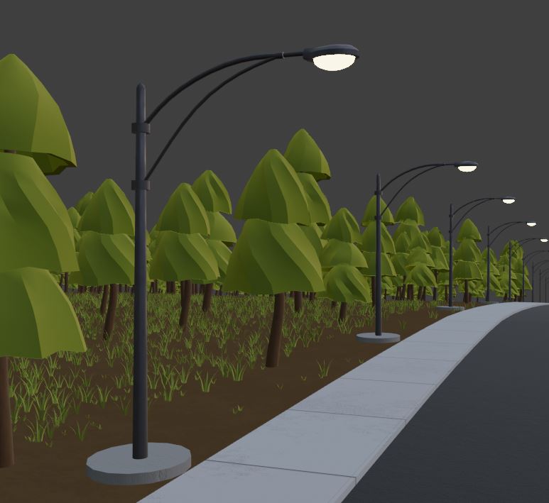
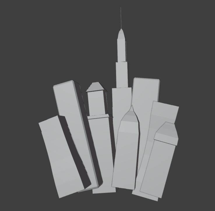
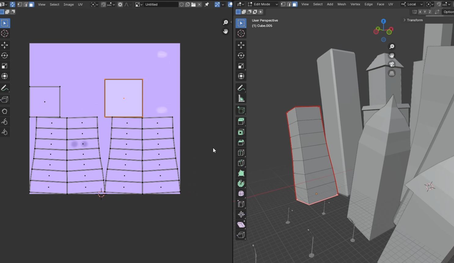
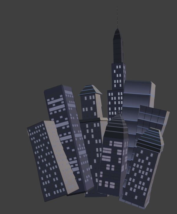
Finally, I only had one thing left in the modelling process: the buildings. I only planned on them all looking a little different, and decided to improvise from there. In the end, I had eight unique buildings that would require their own separate UV map and texture. Why not just variations of a rectangle? Because I wanted to punish my future self with extra work.
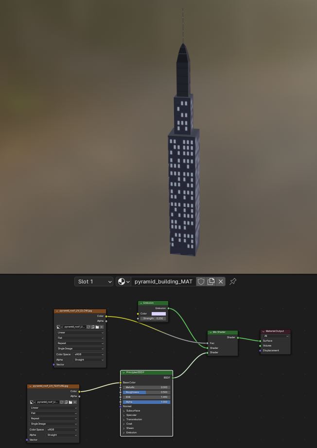
After modelling, I rotated and positioned the buildings so they would all seem to expand from a point in the center. I made extra sure they would have that effect in the final render by adjusting them in the camera view. I then made the UV maps and drew the textures in Clip Studio. To make the material shader I mixed the principled BSDF shader with an emission shader so that each building would have some glowing windows and lights, making the city feel more alive. Though I did make this glow subtle to keep enough attention on the foreground and actual subject matter.
After a little bit of extra tweaking, that was it! The project was done! Time to render!
Rendering and Composition
For the render engine, I went with Cycles rather than Eevee that I used in the previous 3d art of Blockhead. This was because the foreground had multiple light sources that I knew would look better with Cycles’ sampling process. Eevee might make the render look too flat.
When I was editing the image with the post-render nodes, I rendered the forest and characters with the city in the background. After that, however, I split the foreground and background into two separate images to combine in Clip Studio. I’ll explain why later.
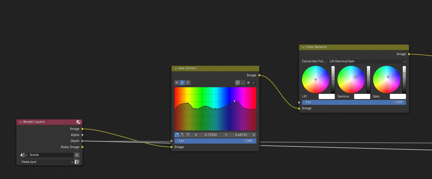
For the rendering, I added a hue correct node to amplify the colors most present in the scene: yellows, greens, blues, and purples. Then I added a color balance node to mix in cool tones and slightly increase the brightness. The original’s dark forest background looked too mysterious for the mood I wanted. By making these adjustments I believe it made the whole image feel safer as the viewer can see the trees a little more clearly.
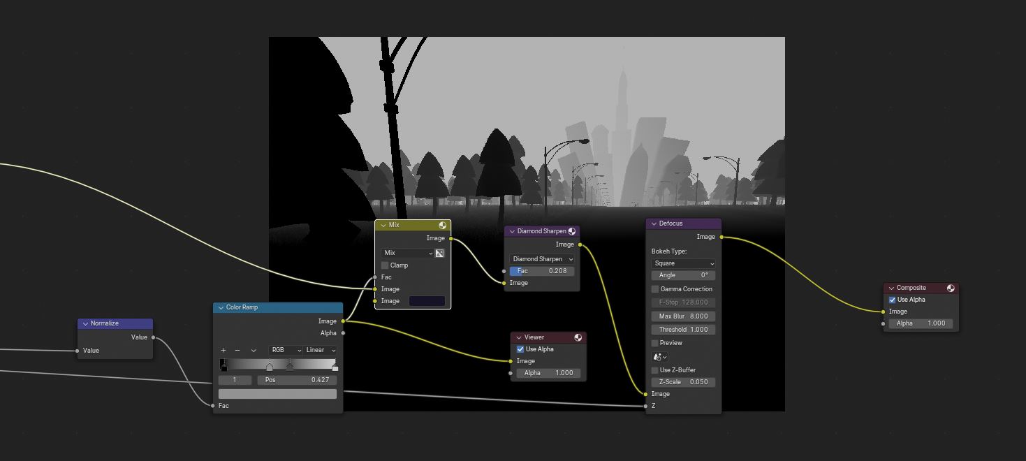
I also had the render include a reference to the depth of the image, or how far away certain objects were to the camera. By adding this, I could add a “defocus” node to blur the background and make the characters more noticeable. I also passed the depth through a color ramp to make it a factor in a mix node between the image and the main color of the background. This made a “mist” similar to that used in games to reduce the number of rendered objects. I used it to further emphasize how far away the city is to the viewer.
However, while it was looking good I didn’t feel like it matched the exact image I had in mind. So, I decided to brute force it. I made the world transparent with an option in Blender and manually created two separate images, essentially the city in the background and everything else. I then took them both into Clip Studio and created another mist using a color I got from the world material shader I previously created. For some extra flair, I emphasized the city lights with a soft brush and added some stars to the background to complete the look.
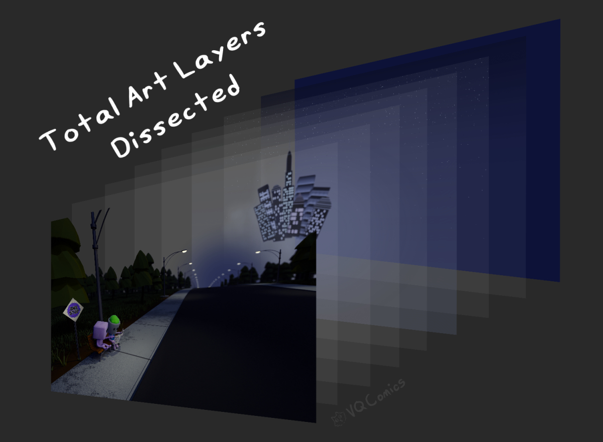
And that was it! Below is a comparison of before and after the post-render edits made in Blender and Clip Studio.


Click here for finished image without the comparison

What now?
Now that this 3d art is done there’s always the difficult question of what happens next. I have some ideas, but nothing concrete. I may make another 3d art with these characters, maybe an animation since both are fully rigged, but I don’t have anything specific in mind. If anything, I could have them exploring the city they both came to visit. I may have them at the parade, but most likely it will be the aquarium.
Anyway, I hope you enjoyed reading my complete breakdown of what this project is and how it came to be. Perhaps put your email in to subscribe for more ramblings? I also have a Ko-fi if you decide that this is of monetary value.
Subscribe for Future Comic and Art Updates!
If you made it this far down the post, thank you for reading! Let me know which one is your favorite: Blockhead, or Planthead?
See you soon!