Concept to Creation: The City’s Always There
Back so Soon!
Hello! I am back, and so soon too! This is the second and final part of my series about the creation of my newest 3D art in Blender: The City’s Always There! The first part goes over the creation of the main character in the piece, Oril. Here, I’ll be highlighting different aspects of my progress in the creation of this most recent 3D artwork! At the end I also have a short animation I created for the project so stay tuned for that!
With this project, it started with a simple line of thinking. When I went to the zoo a few weeks ago I noticed a sign displaying a quote from the founder. He explained that he wanted this zoo, and the surrounding park, to be an escape from urban life. That got me thinking about parks in urban areas. Some of these parks are so large that if you go in far enough the buildings almost disappear behind the trees. Its just you and nature. But what if that wasn’t possible? What if the buildings were so large that you couldn’t really escape them, no matter where you went? Thus came the basis for the W.H.C.
Designing W.H.C Park
In the last post I went over a little bit about what W.H.C is, but I’ll go over it again quickly here. Basically, in this world, there was a massive population boom for unexplainable reasons, causing the planet to become quickly overpopulated. W.H.C, or World Housing Corp, was founded to create a giant city full of sky-scraping apartment complexes to house everyone. Over time, this city became a hub for innovation and many different industries, earning W.H.C a ton of money and prestige. But for Oril, she doesn’t matter in any of that. She just lives here.
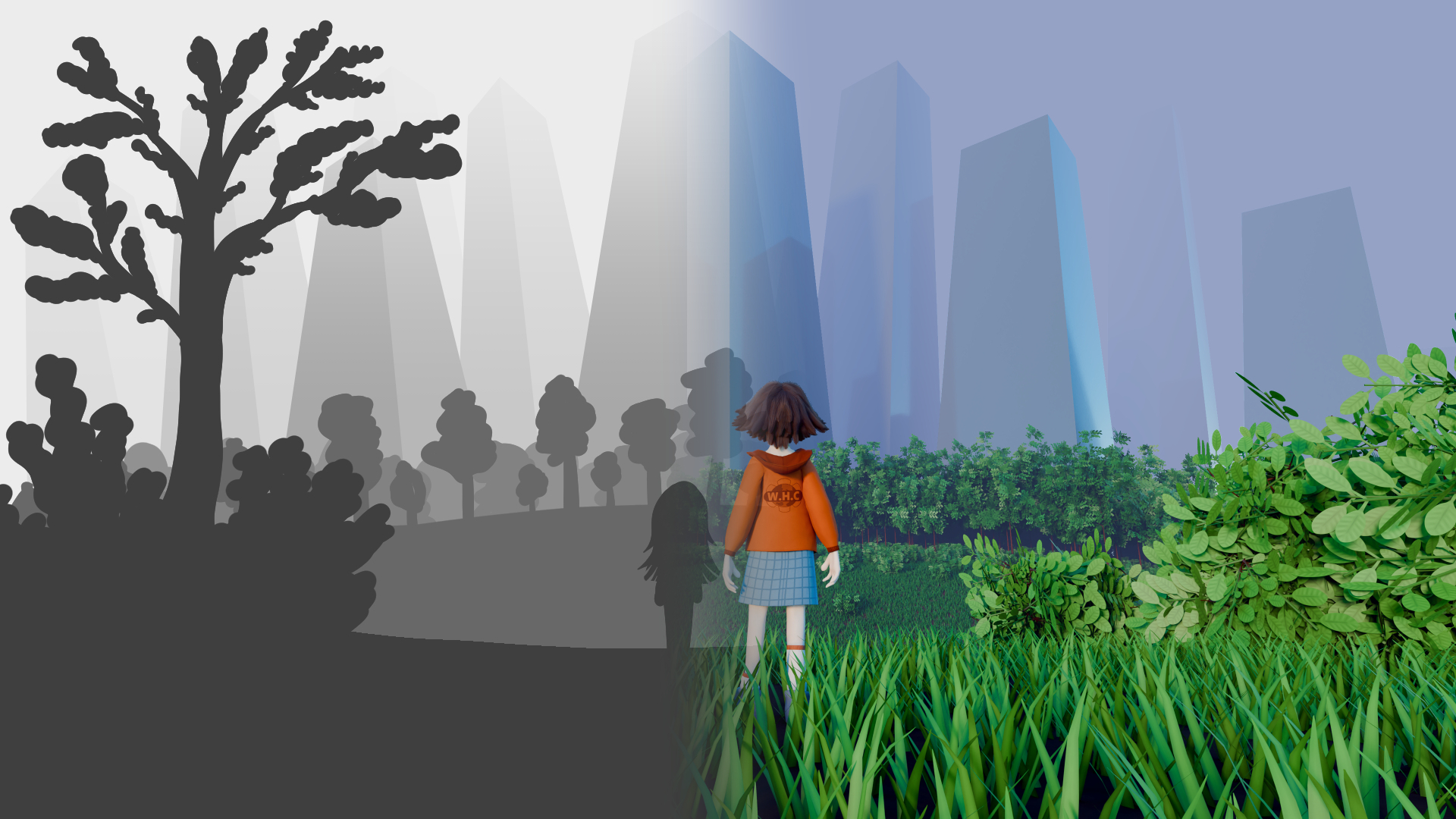
I followed that line of thinking down to the concept design for this 3D artwork. The treeline in the distance of a park meadow, with the buildings looming above them. I designed each building to look imposing, dwarfing our main character in the center. All of them combined look like a crown, showing through design that this company practically controls the world.
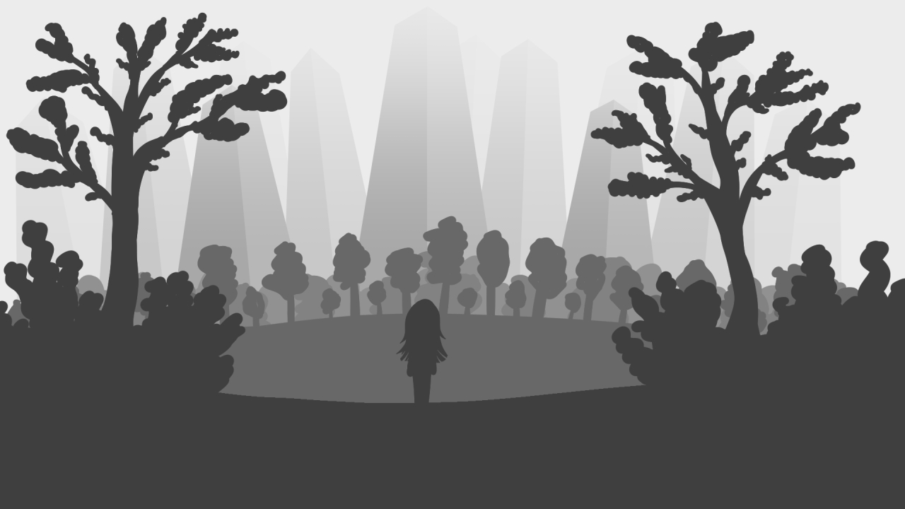
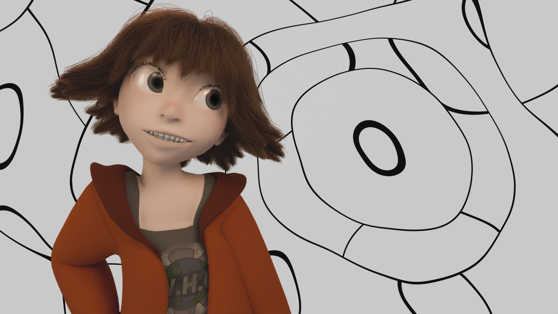
To frame the image I added plants on both sides of the main foreground. I originally had trees as well, but they obstructed the view of the buildings too much so I scrapped them. Oril’s hair was also longer, but I didn’t like the silhouette and I needed something to differentiate her from the background. So I cut her hair and gave her the orange jacket.
Lastly, I’ll address how the concept art looks. While I planned for a full color image, I made the concept art grayscale to define how the contrast looks in the final scene. Basically, this is what it would look like if the color was taken out of the final render. Oril and the foreground would be the darkest, silhouetting the background. The buildings would fade into the atmosphere of the sky itself like mountains on a horizon line. This would make them look much bigger then they actually were in the scene. Admittedly, the final render has a lot less contrast than the initial concept art, but it was a great starting point.
On to Blender!
Starting Large!
I started large with the ground, buildings, and placement of Oril in the scene. For this, I heavily referenced the concept art for how everything would be placed. The buildings were positioned according to how they looked in the static camera rather than the scene. I wanted them symmetrical but slightly imperfect so I opted out of using a mirror modifier in favor of moving each building manually until I was happy with the look.
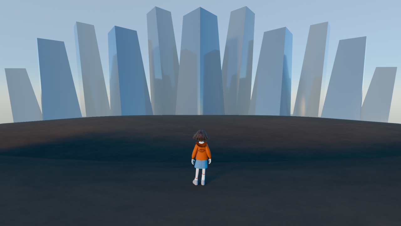
Each building is a stretched out cube with a reflective material. I originally added a texture that defined some windows for a “modern glass skyscraper” design. But it looked weird and overdone so I scrapped it and kept it simple. To get the shape of the buildings right I used a focal length of 15mm on the camera. The buildings in the scene are huge and super close to the park, but the short focal length stretches everything out so it looks much further away. With the basic composition settled, I moved on to the plants.
I Attempt to Garden
Again, I must reiterate from my breakdown of Bus Stop and The Big Fish Exhibit, plants are not my strong suit. But for this project, I wanted to try making trees using curves rather than mesh. Perhaps, they would actually look like trees this time!
Modelling Trees
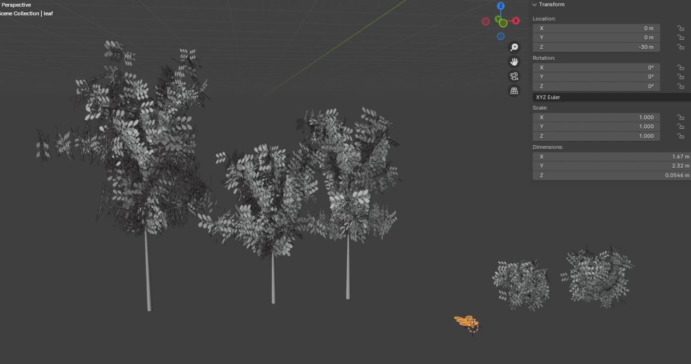
I made the trees and shrubbery using curves, then added weight to those curves to make the branches as thick or thin as I wanted them to be. I ended up with three different trees and two different shrubs for some variation, making each their own separate collection. Then I added them in to the background using geometry nodes.
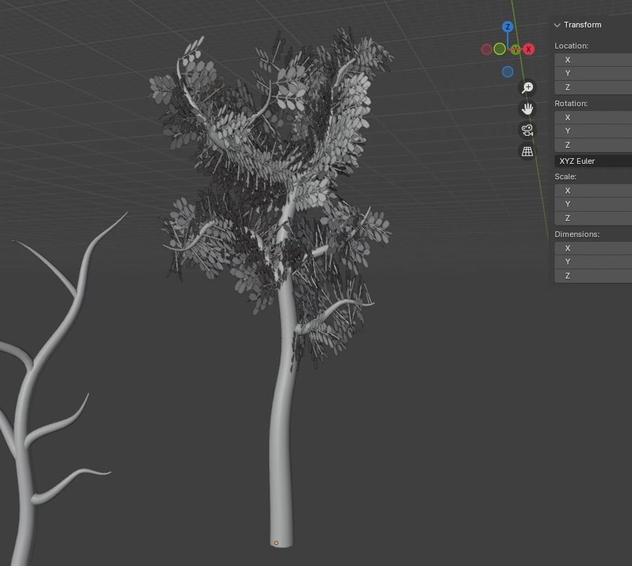
I have to admit, my first round of the trees looked hideous. They were too thick, the color wasn’t right, and I hated how the complex curves made the bushes look more like brambles. I tried again with what I learned not to do, and they turned out much better.
Leaves and Grasses
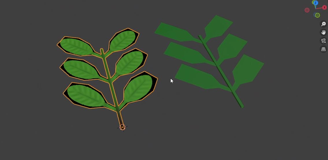
I made the leaves using six planes intersecting a cylinder to look like a smaller branch rather than individual leaves. That way, the tree gets a more believable shape without me having to add a lot of branches manually. Though with the leaves perfectly lined up on either side it looks super flat, so that is something to adjust for next time. I added the leaves in using a particle system, which ends up biting me later in the animation process. Admittedly, I didn’t decide to make an animation until the entire project was basically finished. Had I done so I would have used geometry nodes to add flexibility in the leaf simulation. But it still ended up looking okay.
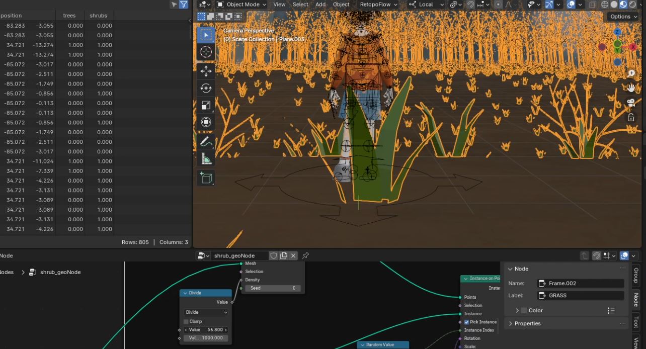
With both the leaves and the grass I made them out of simple shapes, planning to add a more complex design using textures later. The grass still more resembled actual grass than rectangular planes like what I did in The Big Fish Exhibit, but I figured it was fine. I implemented the grass using geometry nodes, sat back, and made a quick test render. And then I came across a problem.
Cutting out the Fluff
Now, I knew the project would be large. The trees alone had least 200 instances, if not more. Then multiply that by the 1200 leaf particles per tree. Then, factor in the shrubs and the thousands of grass particles. There was a lot going on for such a simple scene. The Big Fish Exhibit was large too, but one frame of the final animation took only 55 seconds to render the more detailed exterior at 1440p resolution with 120 samples. At 1080p and 50 samples, a render of this image was already taking 26 seconds. That would only increase with the final render. It just didn’t sit well with me. So, I began my quest to reduce the file size.
Optimization Objective
I started out by cutting down on grass. There was no reason to have so much grass in the scene, so anything invisible to the camera was the first to go. Afterward, I further separated the area between the foreground path where Oril stood and the background, reducing the grass in between. I would later split the two patches of ground into separate objects. The foreground generating grass and the background generating everything else. The foliage in the foreground would be added manually.
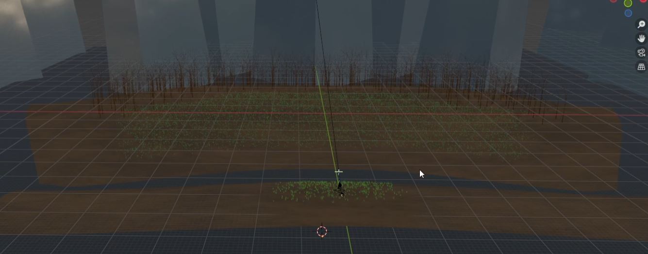
Then I moved onto the other foliage. I pushed back the trees and shrubbery to the very back, adding a few bushes manually to the meadow for a more natural look. Next, I curved the ground downward to hide the where the ground ended. Then, I reduced the number of trees and shrubs as much as I could while still filling the space. Finally I reduced the number of leaves spawned on the trees from 1200 to 1000, and the shrubs from 750 to 450. I probably could’ve gone less, but after a bit it was starting to look barren.
Finally, I targeted the textures. I came up with an experiment to optimize the leaves and grass in the background. Basically, the foliage in the foreground have more geometry and a transparent texture, while the foliage in the background are more simplified with a basic green material. While I thought it was very clever, it only saved a little bit of memory in the final render, while barely affecting the render time.
So Did it Work?
The whole thing probably seems silly, but optimization is something I strive for in my projects. Before I began this whole endeavor, a 1920 by 1080 pixel image rendered at 50 samples would’ve taken around 1260m of memory and 26 seconds to render. Afterward, an image with the same dimensions and sample rate took 960m and around 20 seconds to render. The final render at 3840 by 2160px with a sample rate of 120 took 1131.09m of memory and 2 minutes and 6 seconds to render. It’s overkill, but the larger size makes Oril’s hair look better.
Adding Some Shine
But now that that was taken care of, on to the post render compositing! My goal with a lot of these renders I find is to make the image more vibrant. When I make everything initially, no matter what I try the colors always look dull or desaturated. The compositing nodes are where I attempt to fix that.
A common pair I like to employ are the hue correct and color balancing nodes. The first affects the hue, saturation, and value of isolated colors in the scene, the second alters the colors of the shadows, midtones, and highlights. With both combined I’m able to highlight specific colors, such as Oril’s jacket, and also adjust the scene more broadly until I’m happy with the look.
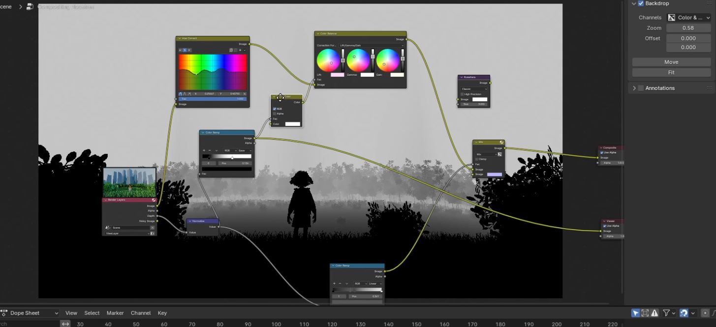
My other goal for this project specifically was to make the mountainous buildings feel more just on the horizon, always looming over anything that anyone does. For that, I added a depth pas to the render and connected it to a color ramp. The color ramp is used as a factor in a mix node to determine the level of atmospheric fog. Its a method I’ve done a few times already, from the recent Big Fish Exhibit to the much earlier Bus Stop. I find it more efficient for what I’m going for than volumetric fog, but some projects may call for that in the future.


Its Going to Move Now
Remember how I said earlier that I didn’t plan for an animation when first making this project? I was going back and forth between whether or not to make an animation for this piece, since its not what I originally planned for. But since it was looking a bit simple compared to The Big Fish Exhibit, I decided a small idle animation would be the perfect thing to finish this whole project out.
This also came with some other last minute adjustments. While I liked the original render, I couldn’t shake that something was off about it, so I let it sit for a week. I realized that the composition of the final piece, with Oril perfectly in the center, was what made it look off. All I really had to do was shift the camera slightly and rearrange the bordering foliage, and it was looking a lot better.
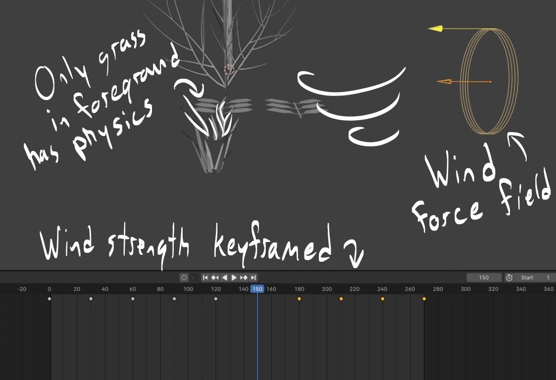
For the animation itself, I planned for simplicity: a gentle wind blowing through the park while the character stands idle. The wind would affect the bushes and grasses in the foreground and the trees in the background. I didn’t think it would be that visible anyway so I opted to keep the bushes and grasses in the background static to save time on rendering.
Plant Physics
For the grasses, I implemented a soft body physics system controlled by a wind force field. To give the grass a gentle swaying motion, I added some keyframes to the wind’s strength to change it over a period of time. I had to make sure that the grass was both flexible enough to flow naturally in the wind, yet stiff enough to not flop over. It was great practice for the soft body physics engine.
For the trees, I focused on the physics engine specific to the leaf particles, leaving the branch static. It ended up being straight forward, if a bit of a disappointing result. Because of previously established problems with rendering objects on hair particles, I couldn’t make the leaves flexible in any way. From far away it looks okay enough, but the bushes in the foreground look stiff and awkward. Using geometry nodes may have helped, but it was getting late at this point anyway and I wanted to move on to greener pastures.
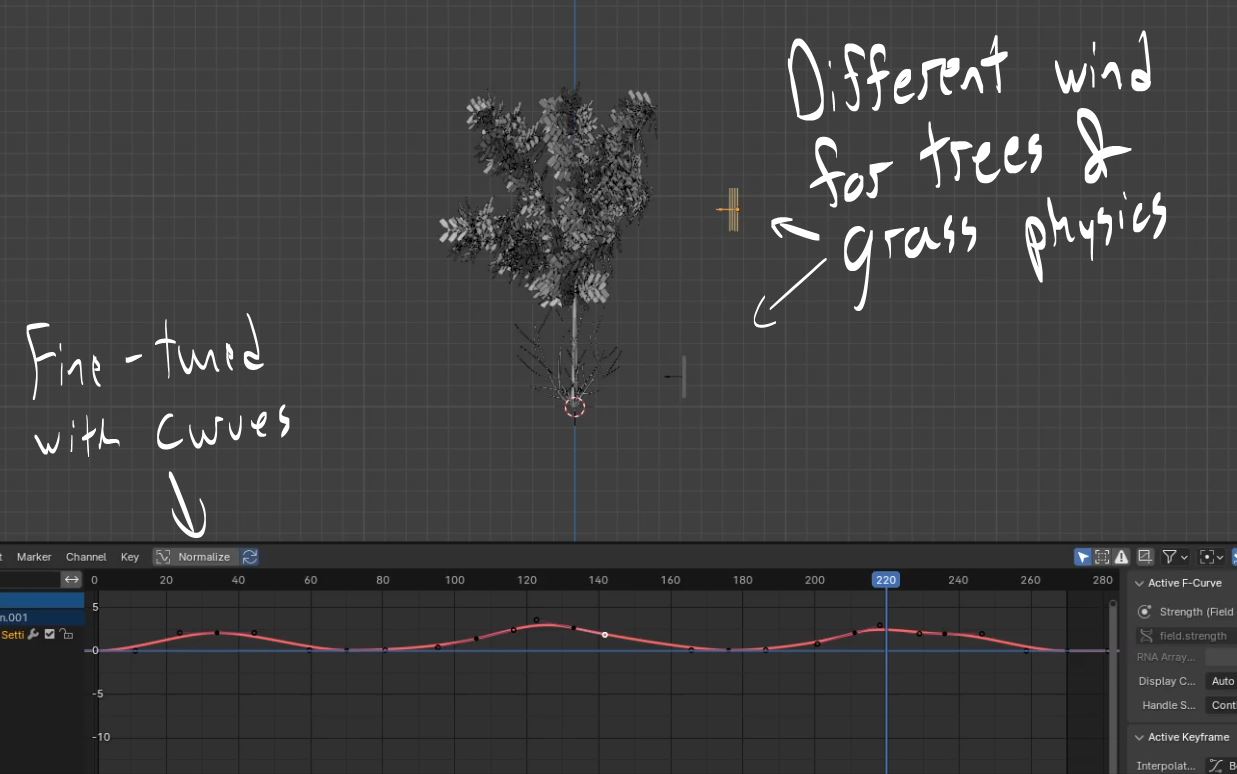
To make the leaves move I used a different force field than the grasses. Because of how stiff the leaves were it would’ve looked too robotic using the same force field, so I made another one. This time, I used the curves between each keyframe to add a few subtle shifts that made the leaves move a little more naturally.
Oril’s Animation
Moving on to Oril, I originally wanted to include a slight breeze ruffling her hair, jacket, and skirt. None of this ended up happening. As much as I loved how I generated her hair using geometry nodes, it came at a cost of the physics engine. There only seemed to be a reference to simulation nodes in the physics tab, which is something I’m not yet familiar with. When I tried to find a tutorial on simulation nodes what I found looked either too inefficient or too complicated for the scope of this project. So I decided to shelve hair physics for the time being.
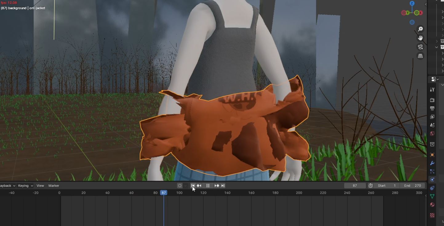
Cloth physics ended up not working either. Admittedly, this was less because of my lack of confidence and more because I was quickly losing steam to continue working on this project. I shelved the jacket almost immediately and moved on to the skirt. While the skirt physics worked out well it wasn’t affected by the wind at all because it was basically a tube of stiff fabric. I could’ve kept the physics in the final render, but as it was barely noticeable I decided to save my resources. I’ll keep it in mind the next time I use the character.
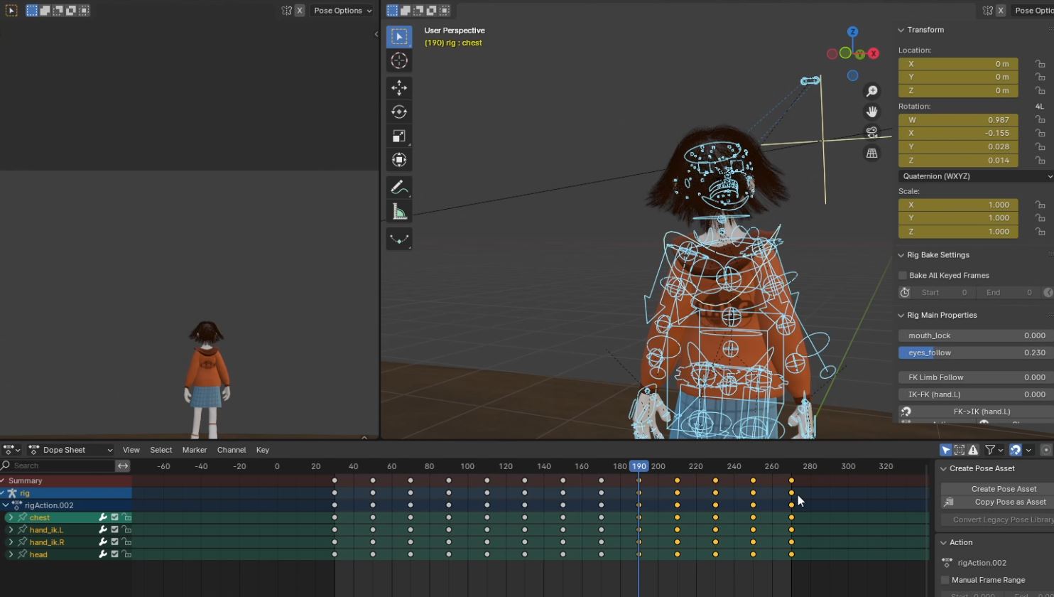
I moved on from the failed physics implementations to the idle animation. The animation itself is designed to loop perfectly from the final frame back to the first. Her breathing was a little too dramatic, but for how far she was from the camera it kept her movements noticeable. After that, the animation took about an hour to render at 1080p and 50 samples. Then I got a few more viewport renders about different facets of the scene, added some music, and threw everything together. Voila! Animation!
And Done!
In conclusion, this project definitely had its ups and downs. I’m definitely getting better at plants, but I still have a ways to go. The same could be said for the soft body physics engine. Oril herself looks great, if a bit simplistic. When getting feedback, someone mentioned how she looks like a stop motion character and now I can’t unsee it.
If you read this to the end than thank you very much for indulging in my ramblings. For my next project, I made plans to model a character from a story idea I had back in February. The character reference is currently collecting digital dust on my computer so I figured why not? If you have any other suggestions, send them my way.

Until next time!