Hello! This is part two of my post about my SciTech Art Challenge submission! Last time, I wrote about each of the three characters in the final submission, and I would encourage you to read through that before moving on to this one.
As a refresher, since I know it has been a bit since that last post, the SciTech Art Challenge was an art challenge from late 2024 hosted by the RenderMan team. Renderman is an external rendering engine created by Pixar, and has produced practically all the Pixar movies as well as many other hits of recent years. I used the free version of the RenderMan engine, available for non-commercial use.
It was a great time getting to use it for this project, and I am a big fan of the final image, even if there are a few things I would’ve done differently once everything was said and done. But I’ll save that for later, right now I want to go back to the beginning, to my very first concepts for the project, and work from there.
Basic Concept
The project itself had some major changes between its initial art and the final product, as you can probably see. I started off by drawing what I thought at the time would be the external view of the environment the final image would be set in. While the final image would be an interior scene, I made it this way to kind of interpret what the backdrop would be for the image as a way to build up the story in my mind before any of the grunt work of modeling characters and props began.
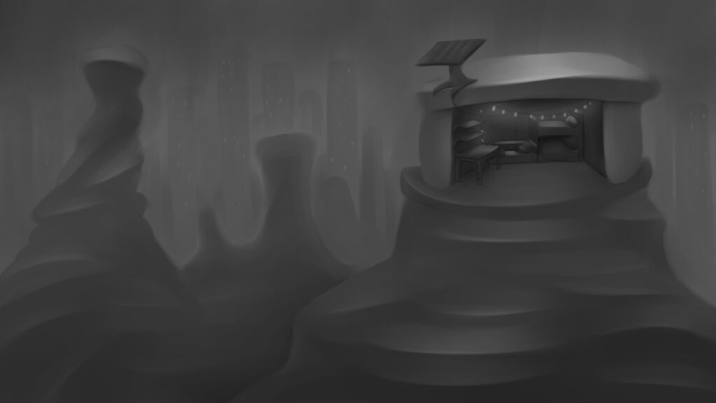
My original idea for the story behind the image was that the three were roommates with a small business collecting trash and refurbishing it by either fixing it, giving it a new coat of paint, or by using parts of it in a completely new thing. Each would have their own job: Mara finds things to potentially sell, Finley fixes them, and Alex makes them look nice and manages the website. The setting would be a city in the background with a supersized dumpster in the foreground, these characters were literally living in the dumpster that they got these items from. The tall spires of trash were kind of reminiscent of the ones from Wall-E, I liked that imagery and I wanted to recreate it. I wasn’t sure if they owned the dump or if they knew someone else who did. But that was my idea that helped guide my initial choices.
However, that idea hit a snag almost immediately because of the simple fact that I don’t know how to model trash. While from far away it does congeal into a general image of garbage, there are so many little instances of litter that make up the average trash heap that I found myself quickly overwhelmed when trying to recreate it early on in the project.
I am someone who likes to make everything by hand if I can help it, I’m not a fan of using assets even if its for something small because I feel like it can take away from the final look of the image. Some assets may feel too cartoony, and some may feel too realistic compared to everything else in the piece. I get very aware of how each asset in a 3D artwork fits with everything else. That and the challenge organizers stated repeatedly that we couldn’t use any assets with any sort of copyright claim on it, only work that was not copyrighted if we didn’t make it ourselves.
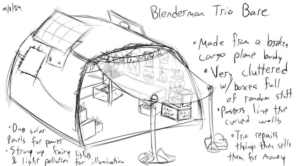
With those two factors in mind, I decided to make everything myself, which also ultimately led me to setting aside the idea of the dumpster setting. Attached to that, I also had the idea of their home/office being set inside the hollowed out piece of a massive airplane body. I thought it would be a creative extension of the fact that they lived among trash. But when I moved the setting to outside the dumpster, I canned that too. Or rather shelved it, because I still think it would be a neat idea, just not for this project.
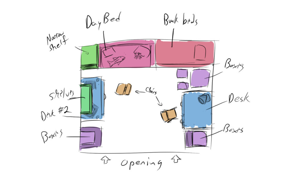
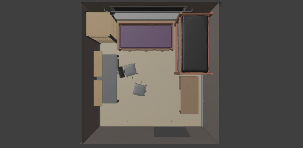
What remained from the concept phase was the floorplan of the bedroom, minus a few minor changes to account for scale. I used it as the blueprint when creating the bedroom for the first time. I liked it because it looked crowded, even as just an initial sketch, with furniture shoved into every possible space. The bunkbed, the daybed in the back, the shelves, the two desks just crammed in there, all worked to create the final look of a bedroom for a group of broke 20-somethings, which is what they were. And, with everything crammed into one side of the room left the other side available for the camera to stand and capture everything.
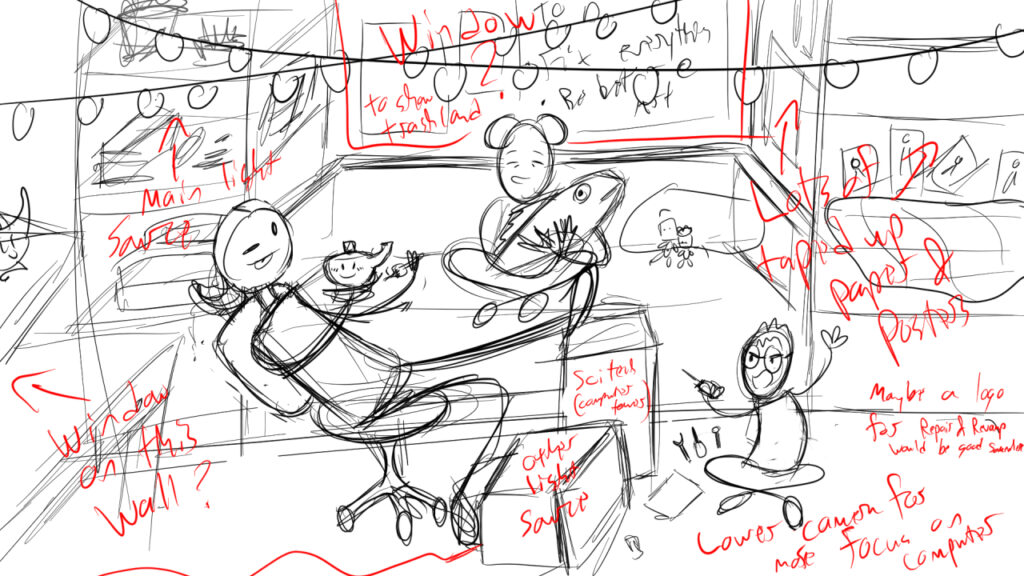
For a final concept before starting the project, I sketched out an idea for how the final image could look. It wasn’t meant to be set in stone, in fact I marked all over the thing for how I could improve, but I did like it as finally getting the composition of the project down on paper, even if the final image looked nothing like it.
Hell, the first render didn’t even look anything like it, the angle and the character placements were completely different. For the initial project, I built up each piece of furniture in the scene using color coded, blocked in objects made simply to get the same proportions as the final assets. There, I could set the characters up how they would look later on and made quick changes as need be. Though, by the time I had made the first render, I also had completed the first piece of furniture, Mara’s daybed. I’ll go over my process for that and the others in the next section
Furniture
When it came to the furniture, I wanted to make sure everything was proportional, which meant paying extra attention to the measurements of each asset to ensure it fit in the room and with everything else. I wanted the furniture to look like something you would find in an average apartment, something inexpensive. Mainly to emphasize how similar this world was to our own. The year this takes place in is 2033, so not that far in the future to where the world looks completely different from how it does now. So, realistically, especially for a group of broke 20 somethings who probably can’t buy high end stuff, the furniture would still look modern and affordable.
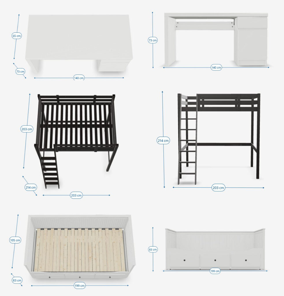
The daybed, bunkbed, and one of the desks were directly based off furniture from Ikea’s online store. They have several listings that feature a 3D object that can be rotated to the viewers liking, complete with measurements. The wall shelves were also based off of an Ikea listing, but I didn’t save an exact reference for them. The shelving unit in the corner was based on a few listings of industrial shelving units from Home Depot. The chairs were based on chairs I had and other listings I saw online, but exact references were also not used. The other table in the background was the only thing that didn’t have an exact reference, but I based it off of an old coffee table I had gotten from Target.
The materials for each were mostly texture based, meaning I unwrapped each asset and drew the texture by hand. I varied the colors of each piece of furniture on purpose, like each person brought some furniture with them when they first moved in so nothing ever fully matched. Most textures, such as wood grain or cloth, was made with default material from Clip Studio, but I did hand paint the metal highlights and any shadows, scrapes, or other imperfections in the wood furniture. Any bump texture I used was subtle, as the wood grain present on most modern pieces of furniture tends to be smooth, noticeable by appearance rather than touch.
Cloth Simulation
Next, I made the various pillows and blankets. The texture for each was a cloth material from Clip Studio overlaying various designs drawn by hand. I balanced the designs between what would represent the three characters and what would look believable for an adult’s bedroom. I went with the black throw blanket for Alex and purple sheets with an abstract design for Mara. Mara was supposed to have a blanket, but I ran out of room. I at first was going to go with orange for Finley, but I decided later that blue looked better as pajamas and orange bedsheets made them look too childish.
Then came the hard part, actually getting the pillows and blankets on the beds. I opted to add the materials to a flat version first, then use a cloth simulation to make it fall realistically. The simulation had to be run many times to get the bedding to fall exactly right. Between each run I adjusted both the initial placement of the bedding and the cloth simulation settings. To save disc space on the simulation cache, only the mattress and frame of each bed were counted as collision objects. Once happy, I applied the physics modifier to permanently freeze the bedding in place.
Smaller Props
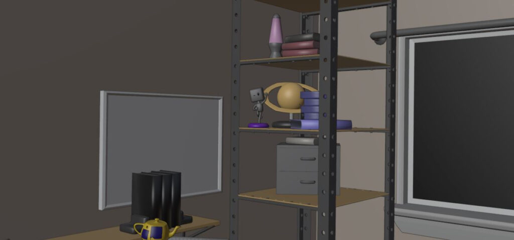
Finally, we get to the smaller props, the many smaller props. This part probably took the longest out of anything I did for this project. Mainly because I wanted to both have this place be as cluttered while still drawing everything by hand. I wanted full control on how the image looked, so almost every material in the final image was texture based. Even the walls I used a material from Clip Studio as the basis for a bump map texture. Also, it was an easy way to stay in the “no copyrighted assets” rule the organizers at RenderMan set, as since it was my own texture I could use it for whatever I wanted.
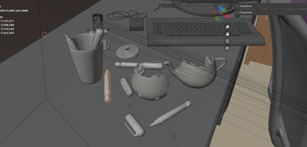
Two exceptions were the Walking Teapot by Dylan Sisson and the SciTech computer assets made by Joshua Mills and Eugene Riecansky. These were part of the asset pack that we had to incorporate in a major part of the final project. I would’ve given them the same treatment as the other assets I made myself, but they had a lot of small parts that I didn’t want to UV unwrap. The only exception was for the computer’s display screen, but I’ll get into that later. For the teacups I opted for either a bronze or a porcelain material. For the computer I opted for procedurally generated noise and a slight shine to look like speckled, rough plastic. I liked how it made it look less pristine.
However, my rule about making my own textures did eventually come back to haunt me. I had ideas for an entire corkboard full of different notes and stuff to further flesh out the characters, as well as a lot more knickknacks of various shapes and sizes that I think the three would collect over time.
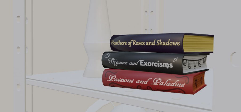
I ended up abandoning both ideas. The process of creating everything for that in the rapidly shrinking time before the deadline became a task just a bit too daunting for me. I had also recently moved states and gotten a new job in retail for the holidays, so that also took time away from the project. So, the corkboard became a whiteboard and the knickknacks were turned into different books and larger props that filled the space.
While I didn’t add textures to the teapots, I still customized them a little bit. To do so, I made some mostly transparent textures, added them to planes, and used the skin modifier to overlay that on top of the teacups. There are probably better ways of doing that, but this was the most straightforward.
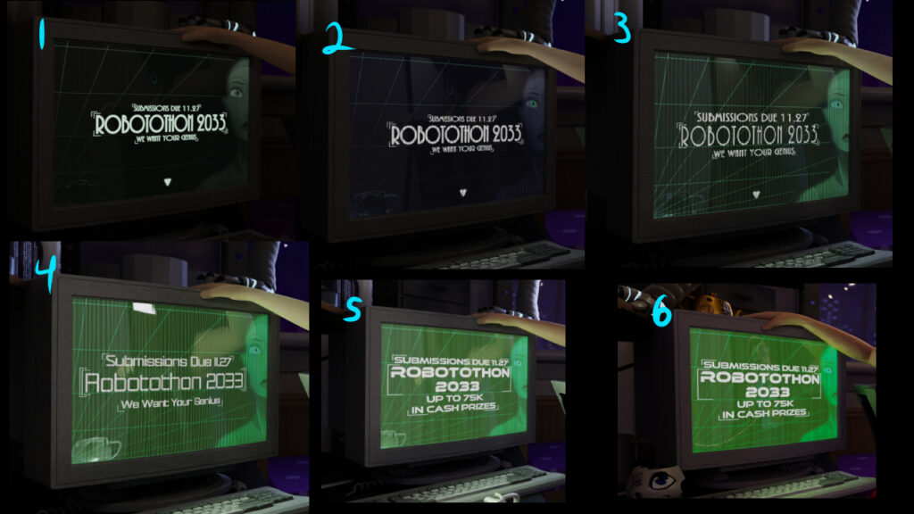
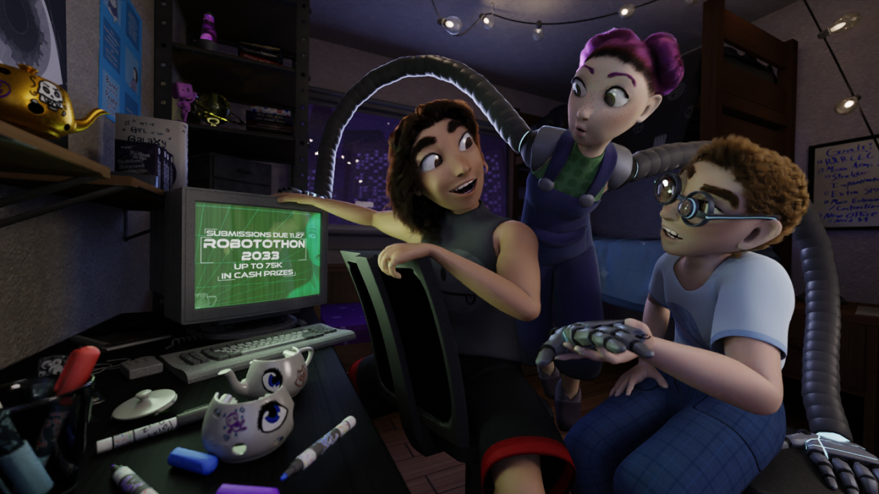
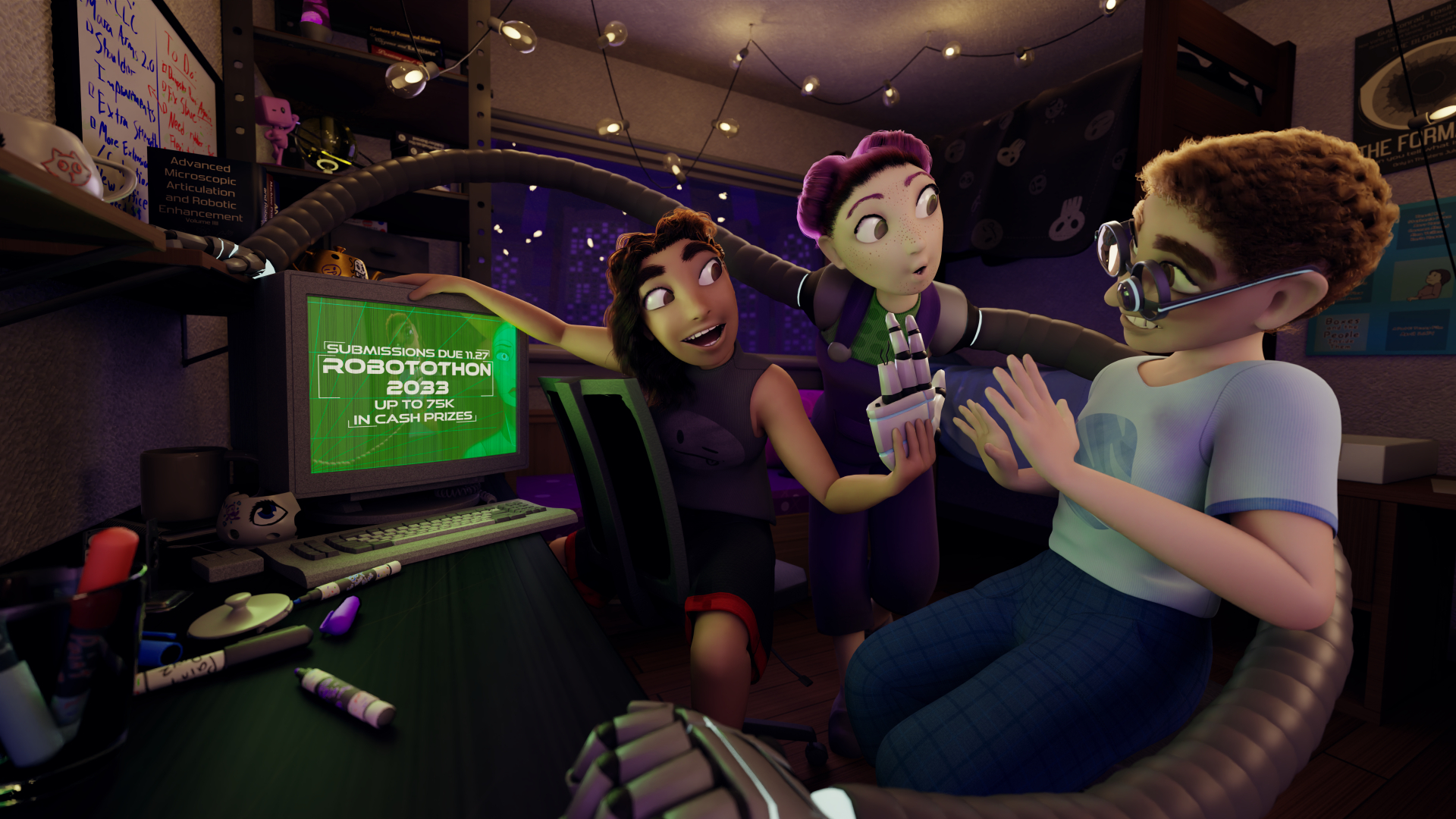
Finally, the most important asset for the final image: the custom computer screen. I made a few iterations of the screen as I received feedback about lighting and text legibility. Eventually I settled on the bright green look with the large text, and the ominous staring robot in the background. Green because often in Disney movies, green lighting represents something evil or nefarious. I wanted to sort of imply that the contest is not all that it seems.
The display became unintentionally the most important part of the story as the story I started with lost its focus. While the trio’s financial hardships remained a core motivation, what they did with that motivation wasn’t as clear as I initially thought. I didn’t feel like I could summarize the operations of their small business down to a single image, so I changed it to them trying to use Finley’s inventions to win money from a contest, the titular Robotothon. Though, as it was pointed out to me during feedback sessions, by the time we get to 2033 75k may not be worth that much. Its the thought that counts.
Lighting
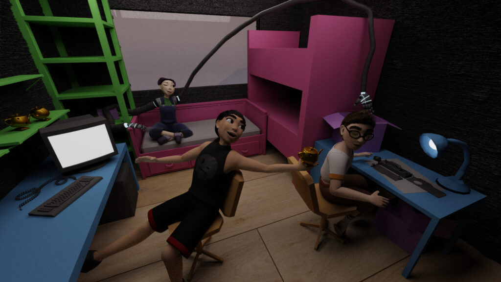
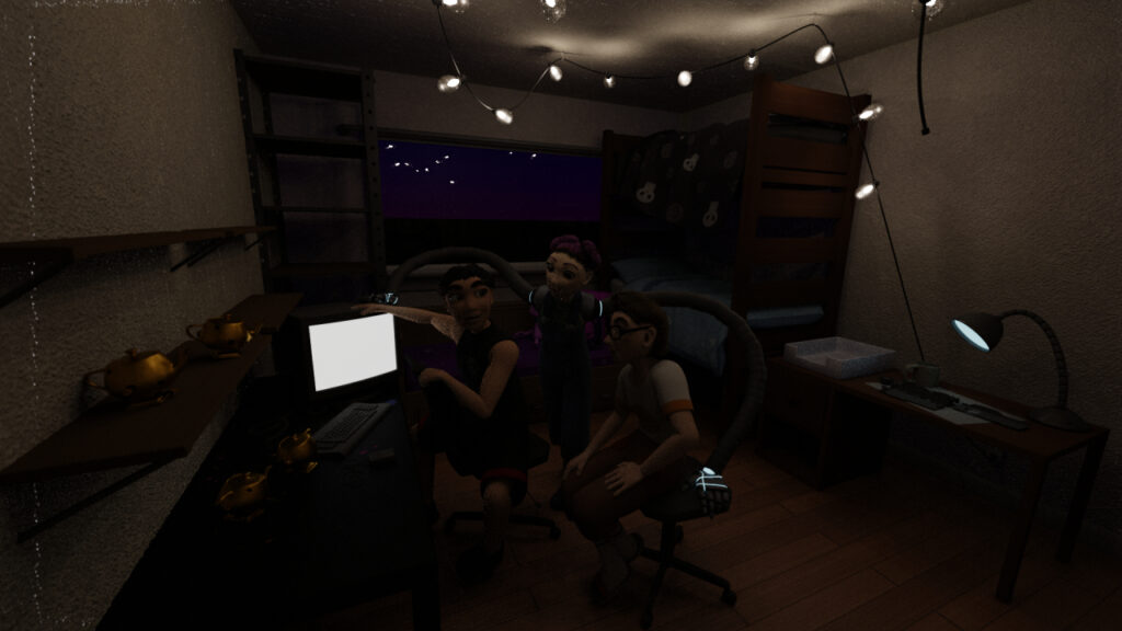
When it came to the lighting, this was where I improved the most between the beginning of this project and the end. That’s because this was also where I got the most feedback. I remember way back when I first got the majority of the work done, and all I thought I had left were the props and a few minor updates, but I wanted to go to one of the feedback sessions to be sure. This was what that render looked like.
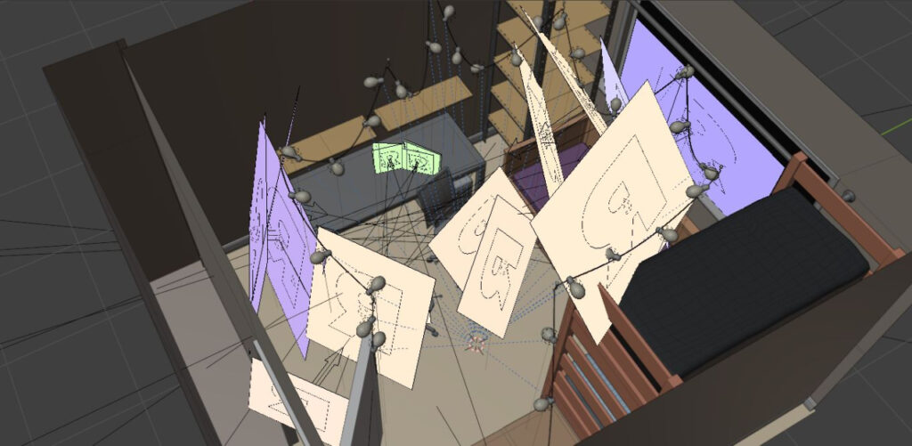
You can probably see what was wrong with it. Sorry, that was a typo. What I meant to say was you can’t see what’s wrong with it because you can’t see anything. I think my main issue was that one of the rules was that all the light had to have a physical source, so I struggled with keeping that rule while keeping the scene fully lit at the same time. I had the fairy lights, the screen, the window and even a random lamp in the background I made just to add one more source of physical lighting. But after that feedback session, I decided “fuck it” and added a bunch of lights in the general areas of each main light source (fairy lights, screen, and window), fully expecting to be called out because none of those light rectangles had a “physical source”. It was during the next feedback session that I found out that was exactly what I was supposed to do. The moral of this story is “physical source” means “add lights in the general area of where a source would be”. Noted!
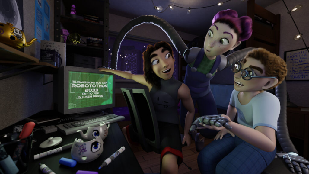
There are four sources of light in the image: the window, the fairy lights, the computer, and the door behind the camera. The light planes emphasize these sources in various intensities for various characters, depending on who needs more or less light to be lit properly in the scene. Some light planes are made to affect only one character via light linking, something possible with both RenderMan and the Cycles render engine in Blender (it may also be possible in Eevee too, but this was the case with 4.0). This essentially allows you to directly affect whether or not a light hits a character, asset, or any other physical thing, which is useful for many different applications.
Aside from the computer screen and window, my other huge source of light were the fairy lights that hung from the ceiling. Going in, they were what I was most excited for in terms of lighting the scene. I first created a few small hooks and attached them to various points in the ceiling as a framework for where the lights were going to go. Then to make the string I used a bezier curve extruded outward to make a thin wire with a basic, rubbery material on top. I had each segment joint of the curve rest just above the different hooks. By using free moving control arms on either side, I could make the line “hang” between each point. When I was happy with it, I made a copy of the curve, hid the original, and converted the copy to a mesh since RenderMan cannot render bezier curves.
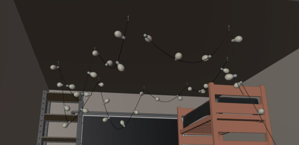
For the lights I modeled a basic bulb with transparent glass and a hollow interior. Inside each bulb was a tiny light sphere that lit up a bit of the nearby space. I used the “clamp to” constraint when moving them to make sure they lined up with the bezier curve wire. Then, I just started duplicating the bulbs until I felt it was the right amount. To make editing the lights easier, I made each light object reference a single set of controls in the editor, kind of like how instances work in geometry nodes. That way, I could edit them all at the same time no matter how many there were.
While the fairy lights looked nice, even with all of them together the characters were still too dark and I still needed some light planes to supplement. This was one of many other tweaks I needed to do to light the characters dynamically, separate them from the background, and set up the right mood for the scene. One of the ways I did this was by adding an extra light source by inventing a door behind the camera. This gave Finley a much needed fill light as they were the closest to the camera, and thus were mostly shadowed from the other light sources by the other two characters. The feedback sessions also led me to warm up the colors a bit. I initially thought the cool tones worked for a night scene, but they also made the image look less inviting, which was not the mood I wanted to set. This was as simple as tinting the bulbs and the supplementing light rectangles a more orange color, as well as lowering the color temperature. It took a few passes, but eventually I was happy with the result.
Camera Work and Composition
Finally, before I wrap everything up with my final thoughts, I wanted explain my thinking behind camera work and compositing. This largely determined where all the props and characters were going to go in the scene. As I stated before, the floorplan of the setting was designed so that barely anything would be behind the camrea. I was making everything by hand and so I wanted everything captured. The only thing behind the camera was a doorway I added later on to give Finley a little extra lighting. By making the camera sit in front of a blank wall, I focused in on what shots I could use for the scene while not fully restricting myself. I could still have upward or downward angles, and could move the camera a little closer where need be. It left room for experimentation.
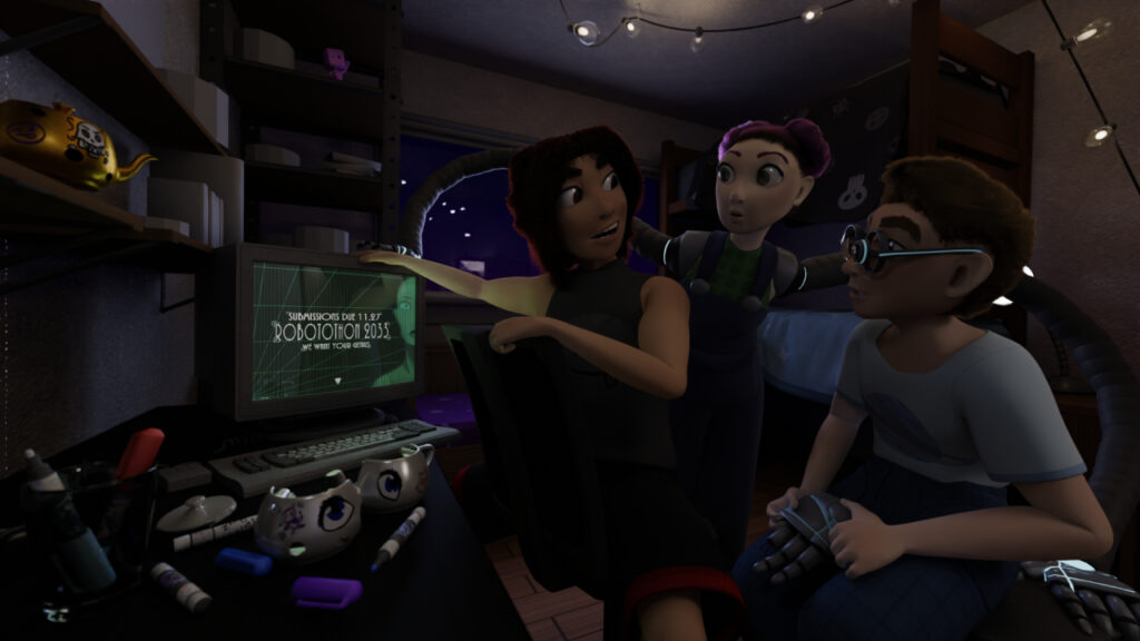
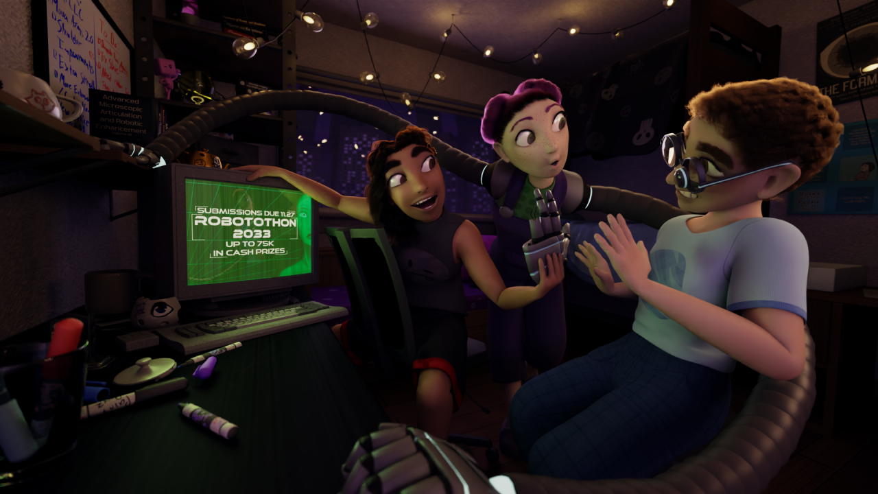
I went though a few different camera angles and character poses over the course of my many work in progress renders. The beginning few renders had a high angle to capture everything, the characters spaced out in the room similar to how they looked in the concept art. But this created three areas of focus in the image, so to narrow it down to one I drew the characters closer together and lowered the camera to more eye level. With many other tweaks I also emphasized poses, directed character focus from the computer screen to what was supposed to be one of Finley’s prototypes for Mara’s arms, and moved the camera even closer.
I really wanted to emphasize a divide between the subject, the three characters, and the background. I did so using Mara’s arms, repositioning them several times to make sure they wrapped around the three subjects in the scene. I also posed Alex to make sure he had a connection between the robot hand he was holding and the screen displaying the Robotothon contest as a way to imply that he’s talking about the contest through gesture.
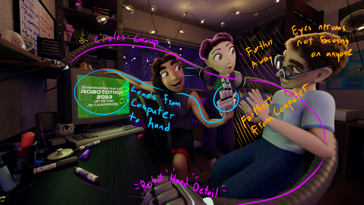
Finally, with Finley my main goal was to display their nervousness about entering the contest through their gesture and the space they give to the other characters. I tried to make sure they had a clear silhouette in the image that differentiated them from Mara and Alex. Despite my repeated adjustments, by the time I had submitted the image I still was not completely on board with the pose I had settled on for them. But that was only one of my gripes with the final result, so lets go over the other ones now.
Conclusion
Overall, I’m happy with the final image, but its not without its faults. I do wish I was able to incorporate more of the original concept of the business. I also kinda wish I hadn’t shied away from the initial idea of the trash dump setting and unique architecture. I can’t help but feel like changing the story of the image so many times over the course of production left the final result feeling rather generic and aimless. There’s almost something there, but it didn’t quite stand out among the myriad of other submissions.
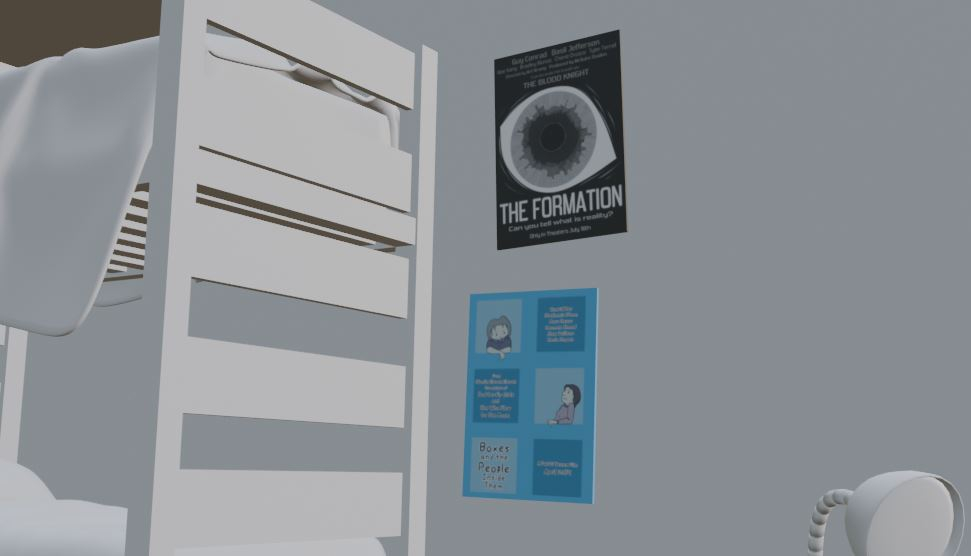
Still, technically speaking its probably the best 3d artwork I’ve made thus far. The lighting alone puts it head and shoulders above others I’ve done, even after this. I’m super proud of the work I put into the props and furniture. Despite having to force myself to do them, the movie posters and books ended up being really fun detail for the background. Plus, the characters looked great in the end, even with the issues that I went over in my last post.
I hope to be able to submit to whatever contest RenderMan has planned for 2025. I’m admittedly on a bit of a creative slump right now. Job hunting just really takes the wind out of one’s sails, you know? But, I did make some stuff already, as you can see on my Bluesky and Cara, and I do have other plans that I will talk about more in the future. So, thanks for reading! Until next time!